Most Requested Symbols

With Monday’s market action, we saw the Bullish Percents for the Oil and Oil Service sectors reverse up into X’s. Bullish Percent charts measure the number of stocks within a given universe that are trading on a Point & Figure buy signal, and therefore serve as a participation indicator for that universe. With the BPOIL chart’s reversal, the chart currently sits at 46%, telling us that 46% of the names we track within the Oil Sector are trading on a buy signal. The BPOILS chart sits at 36% after hitting the 30% level in April. Though we’re seeing positive participation broaden in these sectors, not every name is participating, so it is still important to evaluate prospective positions for technical soundness. To do that, you can use individual RS comparisons, the Query Tool, or Premade Matrices for idea generation. You can view the Oil Service Sector matrix by clicking here and the Oil Sector matrix by clicking here.


Each week the analysts at DWA review and comment on all major asset classes in the global markets. Shown below is the summary or snapshot of the primary technical indicators we follow for multiple areas. Should there be changes mid-week we will certainly bring these to your attention via the report.
| Universe | BP Col & Level (actual) | BP Rev Level | PT Col & Level (actual) | PT Rev Level | HiLo Col & Level (actual) | HiLo Rev Level | 10 Week Col & Level (actual) | 10 Week Rev Level | 30 Week Col & Level (actual) | 30 Week Rev Level |
|---|---|---|---|---|---|---|---|---|---|---|
| ALL |
|
50% |
|
60% |
|
48% |
|
50% |
|
44% |
| NYSE |
|
44% |
|
62% |
|
44% |
|
56% |
|
42% |
| OTC |
|
52% |
|
58% |
|
54% |
|
46% |
|
44% |
| World |
|
46% |
|
52% |
|
|
|
36% |
|
44% |
With action yesterday (4/17), the Bullish Percent for NYSE BPNYSE reversed back up into a column of X’s at 50% from O’s at 44%. This means roughly 6% of stocks within the NYSE universe (which is roughly 2,000) returned to a buy signal over the past week. This reversal puts the offense back on the field in neutral territory – i.e. the 50-yard line. The chart pattern is now Bear Correction meaning the chart is in a column of X’s but on a Point & Figure sell signal. As Tom Dorsey would say, we are at a flashing red light - come to a full stop, look both ways, and proceed with caution. So this reversal into X’s is well-received, but it carries more risk than one that occurs below the 30% mark since that is a lower risk environment, technically speaking. We have to deal with the information we have at hand and though it seems like we've been dealt 7, 2 off-suit so far this year we have to accept that we won’t always be dealt aces. What we can do, given this information, is ease up on the amount of hard stops you may have set over the past month and focus our new buying on strong relative strength groups wherever they may present themselves, be it within US Equity or another asset class.
It is good to see all the major indices return to positive territory on the year and as we have covered in reports, videos, and podcasts over the past few weeks many of the same relative strength trends witnessed in 2017 still hold true today. Just because some areas of the market have been in favor a while does not mean that things must or should change. We have rules in place to move us out of areas of weakness and into areas of strength. This is a time where you can display to your clients that you have set them up for success and have a plan should volatility, geopolitical conflict, or anything else disrupt those areas which currently find themselves in a favorable position.
Here are a couple observations and ways we interpret this chart:
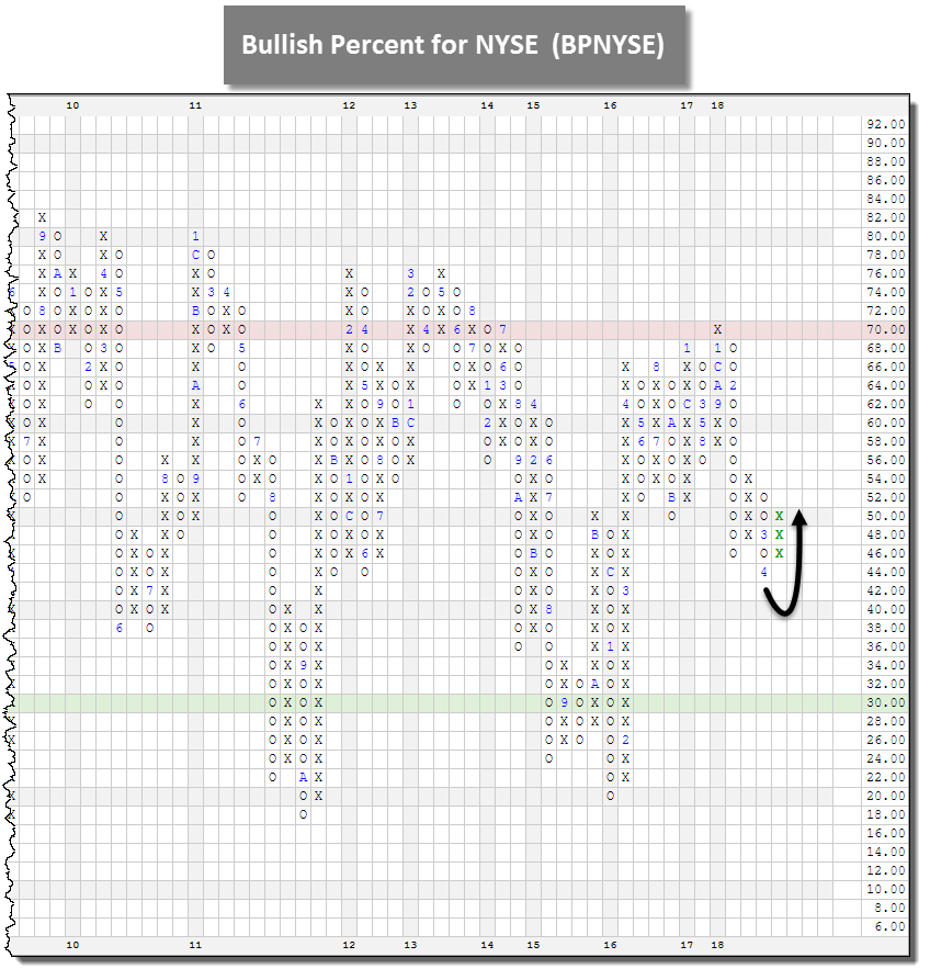
Given the reversal on this chart, we are able to feel more comfortable putting money to work that may be from either a new account or cash that was sitting on the sidelines. Ideally we would be looking for names that are solid citizens (Tech Attribute 3, 4, or 5), trading in a positive trend, are trading on Point & Figure buy signals, and are trading above February support. Two more well known names that caught our attention from the list of stocks that recently returned to a buy signal within the NYSE include Lockheed Martin LMT and Mastercard MA. What would be even better are names that are trading at highs as these are examples of positive divergers from the rest of the broad market. Stay tuned for a feature on these type of names posted in the report on Friday night. In the meantime, if you would like help screening a particular stock or searching for names that would be attractive for your portfolio, take advantage of our tools like DALI ideas or the Query Engine. You may also call our research office to speak with an analyst (804-320-8511).

| Symbol | Name | Price | Yield | Trend | RS Signal | RS Col. | Score | 200 Day MA | Weekly Mom |
| DIA | SPDR Dow Jones Industrial Average ETF Trust | 247.80 | 2.00 | Positive | X | 3.63 | 235.77 | -11W | |
| EFA | iShares MSCI EAFE ETF | 71.22 | 2.53 | Positive | Sell | O | 2.66 | 69.24 | +2W |
| FRN | PowerShares Frontier Markets ETF | 16.15 | 3.34 | Positive | Sell | X | 4.47 | 15.06 | -4W |
| IJH | iShares S&P MidCap 400 Index Fund | 191.43 | 1.27 | Positive | Buy | X | 4.16 | 183.55 | -5W |
| IJR | iShares S&P SmallCap 600 Index Fund | 79.87 | 1.17 | Positive | Buy | X | 5.48 | 74.57 | -4W |
| QQQ | PowerShares QQQ Trust | 166.10 | 0.79 | Positive | Buy | X | 5.58 | 153.90 | -5W |
| RSP | PowerShares S&P 500 Equal Weight ETF | 101.43 | 1.59 | Positive | Buy | X | 4.70 | 98.03 | -5W |
| SPY | SPDR S&P 500 ETF Trust | 270.19 | 1.80 | Positive | O | 2.76 | 259.85 | -5W | |
| VWO | Vanguard FTSE Emerging Markets ETF | 46.62 | 2.31 | Positive | Sell | O | 4.77 | 45.34 | -5W |
| XLG | PowerShares S&P 500 Top 50 ETF | 192.10 | 1.82 | Positive | O | 2.61 | 184.87 | -5W |
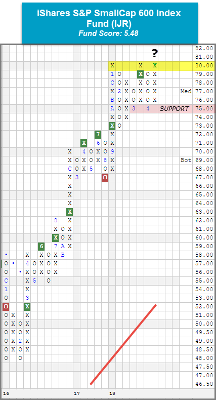
It was a generally positive week (4/10 – 4/17) across the board for the 10 major market ETFs as eight finished higher on the week and two finished lower. The PowerShares QQQ Trust QQQ was the biggest mover to the upside with a gain of 3.03% while the worst performer for the week was the PowerShares Frontier Markets ETF FRN, down -1.64%. As a result of yesterday’s market action, each of the major market ETFs covered in this report are now sitting in positive territory for the year. If you are a regular reader of this report, it comes as no surprise that Small Caps have been an area of strength so far in 2018. In fact, when looking at the Asset Class Group Scores Page, Small Cap Growth and Small Cap Blend both reside in the coveted “blue zone”, meaning they have an average group score of 4 or higher. In DALI, Small Cap Growth is the most improved size and style box in 2018 with a gain of 15 signals. It is sitting in the #2 spot just and only four signals behind #1 ranked Large Cap Growth. The strength in this area of the market is reflected on the chart of the iShares S&P SmallCap 600 Index Fund IJR, which moved higher with yesterday’s trading session to $80. IJR is now testing its all-time high from January and March. From here, a move to $81 would break a spread triple top, which would mark a new all-time high and the third consecutive buy signal since September 2017 at $73. A strong fund score of 5.48 paired with a positive score direction of 0.75 speaks to the fund's absolute strength and relative and improvement over the past six months. When comparing scores, IJR outscores the average Small Cap fund (4.18), the average All US Fund (3.50), and the average US Small Cap Blend fund (4.07) by at least a full score point. Overall, we find that the technical picture remains strong. From here, initial support lies at $75, a level held in both March and April of this year.
(The DWA Technical Indicator link, found under the Indicators menu, provides valuable insight into where positive relative strength readings and positive trend charts are concentrated. RSX is the percentage of stocks within a sector whose relative strength charts are in a column of Xs. RSP is the percentage of stocks within a sector whose relative strength charts are on a buy signal. PT is the percentage of stocks within a sector that are trading above their bullish support lines and the overall trend is positive. The strongest sectors, i.e. market leaders, will have most of these indicators positive and moving higher in a column of Xs.)
Over the past week of trading, 14 sector Bullish Percent charts moved higher while one, the Bullish Percent for Savings & Loans BPSAVI, moved lower. Of the 14 sector BP charts that moved higher, 10 reversed up into Xs. There were not any reversals to the downside. There are now five sectors within 1% of a reversal to the upside: Aerospace Airline, Electronics, Utilities/Electric, Healthcare, and Software. The average sector BP level this week is 48.31%, up 2.76% from last week. There were just two sector shifts on the Favored Sector Spectrum: Previous Metals gained an attribute in its favor but is still Unfavored and the Drug sector lost an attribute, pushing it down to Unfavored status as well.
| Bear Correction | Bull Confirmed | Bull Alert |
|---|---|---|
| Wall Street (46 X) | Oil (46 X) | Oil Service (36 X) |
| Semiconductors (50 X) | ||
| Restaurants (62 X) | ||
| Real Estate (44 X) | ||
| Forest Prods/Paper (56 X) | ||
| Foods Beverages/Soap (48 X) | ||
| Chemicals (50 X) | ||
| Autos & Parts (48 X) |
| To Xs | To Os |
|---|---|
| Aerospace Airline ( 0.59 to 54 ) | None |
| Electronics ( 0.77 to 46 ) | None |
| Utilities / Electric ( 0.86 to 44 ) | None |
| Healthcare ( 0.98 to 54 ) | None |
| Software ( 0.89 to 50 ) | None |
The average Bullish Percent reading this week is 48.31% up 2.76% from the previous week
| 0-14 | 16-20 | 22-26 | 28-32 | 34-36 | 38-42 | 44-46 | 48-52 | 54-56 | 58-62 | 64-66 | 68-72 | 74-78 | 80-86 | 88-100 |
 |
||||||||||||||
| Sector |
|---|
| Precious Metals (24%) - Bear Confirmed |
| Sector |
|---|
| Autos & Parts (48%) - Bear Correction |
| Building (50%) - Bear Correction |
| Chemicals (50%) - Bear Correction |
| Foods Beverages/Soap (48%) - Bear Correction |
| Utilities / Gas (44%) - Bear Correction |
| Internet (50%) - Bear Correction |
| Oil (46%) - Bull Confirmed |
| Oil Service (36%) - Bull Alert |
| Protection Safety Eq (50%) - Bull Alert |
| Real Estate (44%) - Bear Correction |
| Retailing (50%) - Bear Correction |
| Semiconductors (50%) - Bear Correction |
| Wall Street (46%) - Bear Correction |
| Sector |
|---|
| Banks (66%) - Bear Confirmed |
| Business Products (52%) - Bear Confirmed |
| Gaming (64%) - Bear Confirmed |
| Leisure (50%) - Bear Confirmed |
| Savings & Loans (50%) - Bear Confirmed |
PERCENT RELATIVE STRENGTH & POSITIVE TREND UPDATE
(The DWA Technical Indicator link, found under the Database tab, provides valuable insight into where positive relative strength readings and positive trend charts are concentrated. RSX is the percentage of stocks within a sector whose relative strength charts are in a column of Xs. RSP is the percentage of stocks within a sector whose relative strength charts are on a buy signal. PT is the percentage of stocks within a sector that are trading above their bullish support lines and the overall trend is positive. The strongest sectors, i.e. market leaders, will have most of these indicators positive and moving higher in a column of Xs.)
|
|
| ^PT Charts Reversing Up - | ^PT Charts Reversing Down - |
|
|
|
| ^PT Charts Moving Higher - | ^PT Charts Moving Lower - |
|
|
|
|
| ^RSX Charts Reversing Up - | ^RSX Charts Reversing Down - |
| ^RSX Charts Moving Higher - | ^RSX Charts Moving Lower - |
|
|
|
|
| ^RSP Charts Reversing Up - | ^RSP Charts Reversing Down - |
|
|
|
| ^RSP Charts Moving Higher - | ^RSP Charts Moving Lower - |
|
|
|
FAVORED SECTORS LIST
Favored Sectors are those that have three of the four charts (Relative Strength, RSX, RSP, and PT) positive. The table below contains those sectors which changed their favored status over the past week. It is best to focus on those sectors that are about 50% or lower on their Bullish Percent Readings and in a column of Xs on the bullish percent chart. Should a sector move from Favored to Average, that doesn't mean the sector has to be sold.
| Changes since 04/11/2018 | Full Report |
|
|
|
|
||||
|
|
|
|
|
|
||
|
|
|
|
|
|
||
|
|
|
|
|
|
||

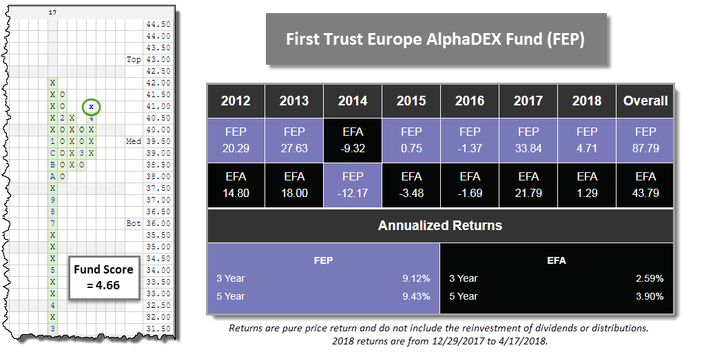
With intraday action on Wednesday (4/18), the First Trust Europe AlphaDEX Fund FEP broke a double top at $41, which completes a bullish triangle pattern. Resistance for those long is visible at the $42 level, its all-time high. Support is now established between $38 and $38.50. The fund offers a score of 4.66, which tops both the average Non-US Equity (3.98) and All Europe (3.58) fund. So far this year, FEP even finds itself within the top decile of All-Funds, up 4.71% through market close on 4/17. Those interested in long exposure may initiate positions on the breakout and use $37.50 as a stop (about 8.5% away). This fund would fit nicely into the International sleeve of a portfolio and could take up a decent size chunk of the Developed Market portfolio, offering a better way to gain exposure to broad Europe than the likes of the iShares MSCI EAFE ETF EFA. The fund possesses an outstanding track record since its launch over EFA, having doubled the returns of the benchmark since 2012. It is also a more stable region considering the rest of the world so you are less likely to endure wild swings in return or risk like the Emerging Europe or Latin America groups.
Those building out a broad International Equity portfolio could use FEP and look to balance it with a Japanese fund to finish out broad Developed Market exposure, and pair it with a mixture of Latin America and Asia Pacific funds to fill the Emerging Market bucket. Those advisors or accounts that are able to be more tactical may find one of our relative strength models, like the First Trust International Model or Deutsche Bank Global ex-US Model (found on the models page), useful to add some relative strength flare to the account.
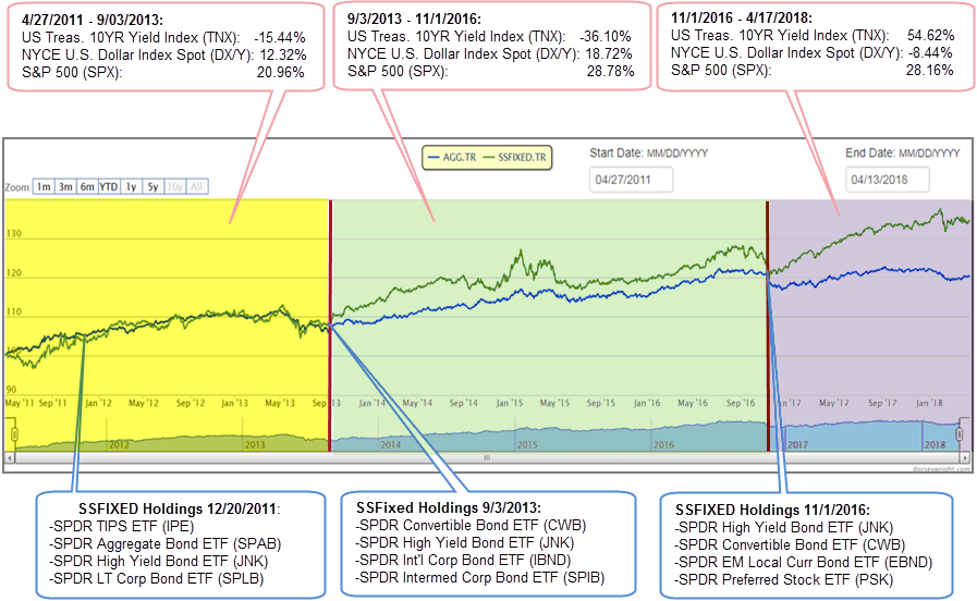
The State Street Fixed Income Model SSFIXED will turn seven years old next week – the model went live on our site on April 27, 2011 – therefore we thought this would be an opportune time to take a look at the current makeup of the model and how it has performed over the years.
SSFIXED is based on a relative strength matrix – the 20 ETF universe is ranked according to relative strength and the model selects the top four funds. If an ETF falls sufficiently in the matrix, it is removed from the model and replaced by the highest ranked fund that is not already a model holding. Through this process, the model seeks to take advantage of current themes and allocate towards areas of strength in the market. The model is currently allocated 75% to foreign bond funds and 25% to convertible bonds, which is in-line with the recent themes of a weak U.S. dollar and strong equity market. It also allocated away from rate-sensitive instruments, e.g. U.S. Treasuries, which have recently shown weakness as a result of rising rates in late 2017 and early 2018.

As you can see in the image below, SSFIXED has outperformed the iShares US Core Bond ETF AGG in four out of the six full calendar years since its inception and on an annualized basis has more than doubled the performance of AGG over the trailing one- and five-year periods.
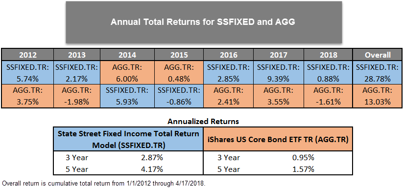
At times, the performance of SSFIXED can look very much like that of AGG, as it did from its inception through September 2013. Over that period, the US Treasury 10YR Yield Index TNX declined by about 15% - a generally positive environment for U.S.-rate-sensitive securities, such as Treasuries and investment grade corporates. As you can see from our snapshot during that period, the makeup of SSFIXED was similar to what we would expect to find in AGG, including Treasuries, SPDR’s U.S. aggregate index tracking fund, and investment grade corporates.
Around September 2013, we begin to see some dispersion between SSFIXED and AGG. The 9/3/13 snapshot shows SSFIXED had exposure to convertible bonds, high yield bonds, int'l corporate bonds, and intermediate corporate bonds. At this point, SSFIXED's exposure looks very different than that of AGG, which would have been dominated by U.S. Treasuries and U.S. investment grade corporates. SSFIXED's holdings in high yield bonds and convertibles wound have positioned it to benefit from the strong equity market that was then in place. Later in the period, we see that although the absolute level of SSFIXED is higher, its movement looks very similar to AGG. At that point, SSFIXED had rotated back to rate-sensitive funds as falling rates rewarded interest rate exposure, leading to relative strength gains in those segments of the fixed income market.
In the final period of our analysis, 11/1/2016 – 4/17/18, we see significant dispersion between AGG the SSFIXED model. Over this period, TNX rose by more than 54%, a difficult environment for a rate-sensitive fund like AGG. Unlike AGG, however, SSFIXED was able to pivot away from rate-sensitive exposure. In the final snapshot, we see that SSFIXED held high yield bonds, convertible bonds, local currency denominated foreign bonds, and preferred stock. Which made it relatively insensitive to rising rates and also made it well-positioned to benefit from the weakening U.S. dollar and robust equity market over that period.
One of SSFIXED's primary advantages is its adaptability. It has the ability to look like a rate-sensitive fund, like AGG, when rates are falling and that is where strength lies within the market. On the other hand, however, unlike AGG, it has the ability to modify its allocation to areas such as foreign bonds and convertibles in order to reduce its rate sensitivity in a rising rate environment and take advantage of other themes a la a weakness in the U.S. dollar or a strong equity market.
On June 01, 2016 SPDR ETFs launched the SPDR Dorsey Wright Fixed Income ETF DWFI that seeks to track the Dorsey Wright Fixed Income Allocation Index DWAFIR, which is based on the State Street Fixed Income Model strategy. For more information on the ETF, visit the SPDR ETFs website here.
Remember, these are technical comments only. Just as you must be aware of fundamental data for the stocks we recommend based on technical criteria in the report, so too must you be aware of important data regarding delivery, market moving government releases, and other factors that may influence commodity pricing. We try to limit our technical comments to the most actively traded contracts in advance of delivery, but some contracts trade actively right up to delivery while others taper off well in advance. Be sure you check your dates before trading these contracts. For questions regarding this section or additional coverage of commodities email ben.jones@dorseywright.com.
Data represented in the table below is through 04/18/2018:
Broad Market Commodities Report
| Symbol | Name | Price | Trend | RS Signal | RS Col. | 200 Day MA | Weekly Mom |
| CL/ | Crude Oil Continuous | 66.47 | Positive | Buy | X | 55.90 | +2W |
| DBLCIX | Deutsche Bank Liquid Commodities Index | 358.21 | Negative | Sell | O | 331.44 | +5W |
| DWACOMMOD | DWA Continuous Commodity Index | 478.61 | Positive | Sell | O | 462.08 | +1W |
| GC/ | Gold Continuous | 1350.30 | Positive | Buy | X | 1299.69 | +3W |
| GN/Y | S&P GSCI Index Spot | 464.85 | Positive | Sell | O | 417.92 | +2W |
| HG/ | Copper Continuous | 3.08 | Positive | Buy | X | 3.04 | +1W |
| ZG/ | Corn (Electronic Day Session) Continuous | 380.25 | Positive | Sell | X | 358.77 | -2W |
| Links to Additional Summaries |
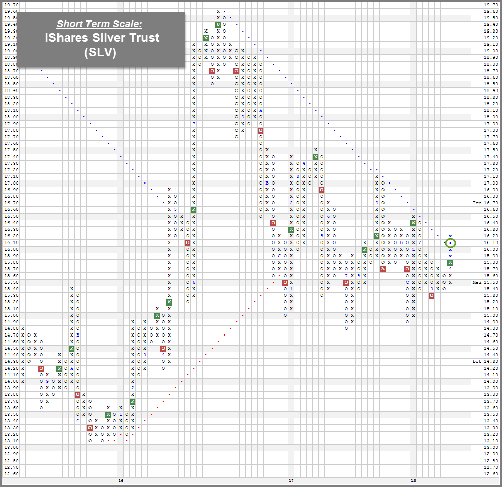
Over the past couple of weeks, Precious Metals, along with Oil (See: ETF Spotlight), have been bright spots in the broad commodity market. For example, over the past 30 Days, Gold Continuous GC/ gained 2.79% while the S&P 500 SPX fell -1.66%. Additionally, as you can see in the Portfolio View - Commodity Indices table above, Gold's GC/ weekly momentum has been positive for the last three weeks. GC/ has rallied along with the rest of the commodity space, as the S&P GSCI Index Spot GN/Y has also made a positive run, seeing that it's up 4.55% over the past 30 days. Like Gold, Silver SLV has improved as well. For example, the iShares Silver Trust SLV has rallied 2.66% over the past 30 days. It's still in the red for the year, but it's within a couple percent from flipping positive. The recent bounce in Silver prices has also been enough to push its short term chart into a positive trend. SLV managed to breakout the negative trendline at $16.10, flipping the trend back to positive for the first time since 2016. With Silver improving on a near term basis, traders can consider SLV on the breakout. Support can be found around its March low at $15.30.
(As of 4/18/18)
The Distribution Report below places Major Market ETFs and Indices into a bell curve style table based upon their current location on their 10-week trading band. The middle of the bell curve represents areas of the market that are "normally" distributed, with the far right being 100% overbought on a weekly distribution and the far left being 100% oversold on a weekly distribution. The weekly distribution ranges are calculated at the end of each week, while the placement within that range will fluctuate during the week. In addition to information regarding the statistical distribution of these market indexes, a symbol that is in UPPER CASE indicates that the RS chart is on a Buy Signal. If the symbol is dark Green then the stock is on a Point & Figure buy signal, and if the symbol is bright Red then it is on a Point & Figure sell signal.
The average Bullish Percent reading this week is 48.31% up 2.76% from the previous week
| <--100 | -100--80 | -80--60 | -60--40 | -40--20 | -20-0 | 0-20 | 20-40 | 40-60 | 60-80 | 80-100 | 100-> | |||
|
||||||||||||||
| Symbol | Name | Symbol | Name |
| AGG | iShares US Core Bond ETF | NASD | Nasdaq Composite |
| CL/ | Crude Oil Continuous | NDX | NASDAQ-100 Index |
| DJIA | Dow Jones Industrial Average | RSP | Guggenheim S&P 500 Equal Weight ETF |
| DVY | iShares Dow Jones Select Dividend Index | RUT | Russell 2000 Index |
| DX/Y | NYCE U.S.Dollar Index Spot | SHY | iShares Barclays 1-3 Year Tres. Bond Fund |
| EFA | iSharesMSCI EAFE Index Fund | SML | S&P 600 Small Cap Index |
| FXE | CurrencyShares Euro Trust | SPX | S & P 500 Index |
| GC/ | Gold Continuous | TLT | iShares Barclays 20+ Year Treasury Bond Fund |
| GSG | iShares S&P GSCI Commodity-Indexed Trust | UV/Y | Continuous Commodity Index |
| HYG | iShares iBoxx $ High Yield Corporate Bond ETF | VOOG | Vanguard S&P 500 Growth ETF |
| ICF | iShares Cohen & Steers Realty Index | VOOV | Vanguard S&P 500 Value ETF |
| IEF | iShares Barclays 7-10 Yr. Tres. Bond Fund | VWO | Vanguard FTSE Emerging Markets ETF |
| LQD | iShares iBoxx $ Investment Grade Corp. | XLG | Guggenheim S&P 500 Top 50 ETF |
| MID | S&P 400 MidCap Index |
In the Optionable Universe, this week we saw 12 relative strength buy signals compared to 8 last week. On the sell side, there were 2 relative strength sell signals compared to 5 last week.
| Symbol | Company | Sector | Price | RS vs Market Signal | RS vs Market Column | RS vs Peer Signal | RS vs Peer Column | Trend |
|---|---|---|---|---|---|---|---|---|
| HES | Hess Corporation | Oil Companies Secondary | 56.330 | Buy | X | Sell | X | 3 |
| CKH | Seacor Smit, Inc. | Oil Drilling, Equipment Svcs | 57.590 | Buy | X | Buy | X | 5 |
| COP | ConocoPhillips | Oil Companies Major | 66.510 | Buy | X | Sell | X | 4 |
| DLB | Dolby Laboratories, Inc. | Industrial Goods & Svcs | 68.020 | Buy | X | Buy | X | 4 |
| ABEO | Abeona Therapeutics Inc. | Pharmaceuticals | 19.300 | Buy | X | Buy | X | 5 |
| MBI | MBIA Inc. | Insurance | 9.170 | Buy | X | Buy | X | 5 |
| MPC | Marathon Petroleum Corp. | Oil Companies Major | 78.550 | Buy | X | Buy | X | 5 |
| QEP | QEP Resources Inc. | Oil Companies Major | 11.550 | Buy | X | Sell | X | 3 |
| PBF | PBF Energy Inc. | Oil Companies Major | 37.500 | Buy | X | Buy | X | 5 |
| TNET | Trinet Group Inc. | Industrial Goods & Svcs | 50.270 | Buy | X | N/A | X | 4 |
| PCTY | Paylocity Holding Corporation | Software | 56.490 | Buy | X | Sell | X | 3 |
| BLCM | Bellicum Pharmaceuticals, Inc. | Biotechnology | 7.840 | Buy | X | Sell | X | 3 |
| Comments |
|---|
| ALLE Allegion PLC ($86.50) - Protection Safety Equipment - ALLE broke a double top at $87, just eight days before expected earnings. This stock is a perfect 5 for 5’er that has maintained a market RS buy signal since September 2015. Additionally, it ranks 3rd out of 11 names in the Protection Safety Equipment. The price target is $111, suggesting the potential for higher prices. Okay to buy or hold here. Note overhead resistance between $88 - $89. Support lies at $83. |
| BA The Boeing Company ($341.50) - Aerospace Airline - BA broke a double top at $340. The stock has now given two consecutive buy signals after establishing support at the $312 level. The stock continues to maintain an overall positive technical picture so those interested in long exposure or putting money back to work in BA may initiate positions on this breakout. From here, we would use $308 as a stop. Note, earnings are expected on 4/25. |
| BBY Best Buy Co., Inc. ($75.40) - Retailing - BBY broke a double top at $74 and continued higher intraday to $75. The stock continues to offer all five positive technical attributes, just flipped to positive weekly momentum, and ranks in the top half of the Retailing sector matrix. New positions may be initiated on this breakout. Support is offered throughout the upper $60s. Those already long face resistance in the upper $70s. |
| CSX CSX Corporation ($60.29) - Transports/Non Air - CSX broke a double top at $59 and continued higher intraday to $60, which tests its previous high from January this year. The stock comes with a technical attribute score of 4, a bullish price objective of $77, and ranks near the top quartile of the Transports/Non Air sector matrix. New positions may be initiated on this breakout or a break to $61. The first sign of trouble comes with a move to $53, a double bottom break. |
| DLB Dolby Laboratories, Inc. ($69.03) - Electronics - DLB completed a bullish triangle pattern with a move to $69 on Wednesday, marking the third consecutive buy signal on the chart. This stock is a strong 4 for 5’er that has been trading in a positive trend for over two years. Additionally, the price target is $88, suggesting the potential for higher prices. DLB is a holding in the DWA Electronics Sector Portfolio as it is one of the stronger names within this sector. Demand is in control and the weight of the evidence is positive. Okay to buy or hold. From here, support lies at $62. Note overhead resistance at $74. |
| FSLR First Solar, Inc. ($78.15) - Semiconductors - FSLR broke a triple top at $75, which completes a shakeout pattern. The stock continued higher intraday to the $78 level, a new 52-week high. The stock ranks in the top ten of the Semiconductors sector matrix and offers four positive technical attributes. New positions are best served on a pullback from here. Support is offered at $68 and earnings are approaching on 4/26. |
| HAE Haemonetics Corp ($76.17) - Healthcare - HAE broke a double top at $76, which is the 7th consecutive buy signal dating back to August 2016. The 5 for 5'er ranks in the top decile of the Healthcare sector matrix and now trades at all-time highs. New positions are welcomed on this breakout or a pullback. Support is visible at $71 and $69 from here. Earnings are expected on 5/8. |
| HI Hillenbrand, Inc. ($48.85) - Retailing - HI broke a double top at $49, a new all-time high on the chart as well as the fifth consecutive buy signal. This stock is a perfect 5 for 5’er as all of its trending and RS characteristics are positive here. Weekly momentum just flipped positive, suggesting the potential for higher prices. Okay to initiate new positions here or on a pullback. Support lies at $45. Note earnings are slated for 5/1. |
| INTC Intel Corporation ($54.16) - Semiconductors - INTC broke a triple top at $54, which completes a shakeout pattern. The stock now trades at multi-year highs not seen since 2000. The 4 for 5'er ranks in the top quartile of the Semiconductors sector matrix and also comes with a yield north of 2%. New positions may be initiated on this breakout. Support is found in the upper $40's from here and earnings are expected on 4/26. |
| OLLI Ollies Bargain Outlet Holding Inc. ($63.60) - Retailing - OLLI broke a double top at $64, a new all-time high. This stock is a strong 4 for 5’er that has maintained a positive trend since November 2015. Additionally, the bullish price objective is $80, suggesting the potential for further upside. Monthly momentum has been positive for four months, adding to the positive technical picture. Okay to buy or hold here. Support lies at $60 and $55. |
| Name | Option Symbol | Action | Stop Loss |
|---|---|---|---|
| Seagate Technology - $62.11 | O:STX 18I60.00D21 | Buy the September 60.00 calls at 7.20 | 56.00 |
| Name | Option | Action |
|---|---|---|
| Chevron Corporation ( CVX) | Jun. 115.00 Calls | Raise the option stop loss to 7.75 (CP: 9.75) |
| Textron Inc. ( TXT) | Jun. 55.00 Calls | Initiate an option stop loss of 7.45 (CP: 9.45) |
| Total System Services Inc ( TSS) | Aug. 80.00 Calls | Raise the option stop loss to 8.10 (CP: 10.10) |
| Halliburton Company ( HAL) | Oct. 45.00 Calls | Raise the option stop loss to 6.40 (CP: 8.40) |
| NetApp, Inc. ( NTAP) | Sep. 60.00 Calls | Raise the option stop loss to 9.40 (CP: 11.40) |
| IntercontinentalExchange Inc. ( ICE) | Sep. 67.50 Calls | Raise the option stop loss to 6.60 (CP: 8.60) |
| Costco Wholesale Corporation ( COST) | Jun. 180.00 Calls | Raise the option stop loss to 16.20 (CP: 18.20) |
| Name | Option Symbol | Action | Stop Loss |
|---|---|---|---|
| The Walt Disney Company - $101.21 | O:DIS 18U105.00D21 | Buy the September 105.00 puts at 7.25 | 114.00 |
| Name | Option | Action |
|---|---|---|
| Mondelez International Inc. (MDLZ) | Jun. 47.00 Puts | Stopped at 4.65 (CP: 4.00) |
| Noble Energy Inc. (NBL) | May. 32.50 Puts | Stopped at 34.00 (CP: 33.62) |
| L Brands Inc. (LB) | May. 45.00 Puts | Raise the option stop loss to 8.80 (CP: 8.80) |
| PACCAR Inc. (PCAR) | Aug. 67.50 Puts | Stopped at 71.00 (CP: 70.88) |
| FMC Corporation (FMC) | Oct. 80.00 Puts | Stopped at 82.00 (CP: 82.74) |
| PACCAR Inc. (PCAR) | Aug. 70.00 Puts | Stopped at 71.00 (CP: 70.88) |
| Schlumberger Limited (SLB) | Aug. 70.00 Puts | Stopped at 70.00 (CP: 70.34) |
| Name | Option Sym. | Call to Sell | Call Price | Investment for 500 Shares | Annual Called Rtn. | Annual Static Rtn. | Downside Protection |
|---|---|---|---|---|---|---|---|
| Boyd Gaming Corp $34.40 | O:BYD 18I37.00D21 | Sep. 37.00 | 2.20 | $16,606.20 | 24.21% | 12.88% | 5.22% |
| Name | Action |
|---|---|
| First Solar, Inc. (FSLR) - 72.68 | Sell the September 75.00 Calls. |
| Urban Outfitters, Inc. (URBN) - 39.36 | Sell the September 39.00 Calls. |
| Avis Budget Group, Inc. (CAR) - 47.58 | Sell the August 52.50 Calls. |
| Aaron's, Inc. (AAN) - 48.24 | Sell the August 50.00 Calls. |
| Deckers Outdoor Corporation (DECK) - 94.67 | Sell the September 97.50 Calls. |
| First Solar, Inc. (FSLR) - 72.68 | Sell the September 75.50 Calls. |
| Michael Kors Holdings Limited (KORS) - 66.84 | Sell the August 67.50 Calls. |
| Michael Kors Holdings Limited (KORS) - 66.84 | Sell the August 70.00 Calls. |
| Name | Covered Write |
|---|---|
| Planet Fitness Inc ( PLNT - 40.47 ) | August 40.00 covered write. |
Daily Equity & Market Analysis
Loading, Please Wait...
