Most Requested Symbols

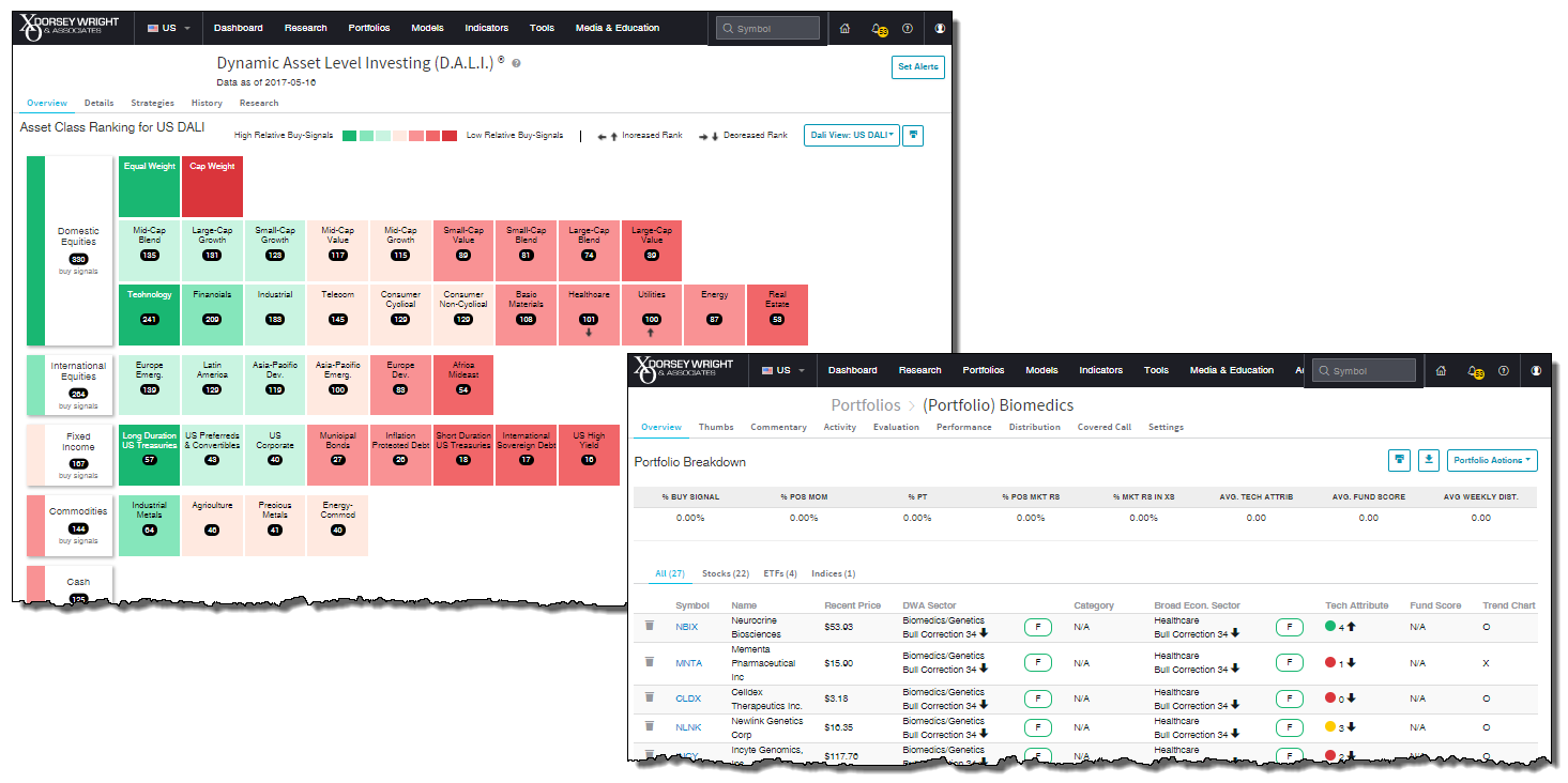
Today, we want to announce the launch of the beta site for the Dorsey Wright Platform! Current DWA subscribers have the ability to access the beta site by clicking on the link in the upper left hand corner of either your custom Dashboard or the Welcome pages. The beta site currently reflects phase one of our website redesign, and we are looking for feedback in order to help better the Platform. In addition to the link that transfers user to the beta site, we have also provided a link to the message board where feedback can be provided.

The changes reflected in the beta site are primarily cosmetic, and are meant to simplify the layout of a number of pages. For the most part, the functionality contained within these pages has remained unchanged. With this first phase we focused on simplifying the Portfolios Tool and the Dynamic Asset Level Investing (D.A.L.I) Tool. So, be sure to explore these pages. We have highlighted some of the more notable changes below.
DALI:
Portfolios:

Each week the analysts at DWA review and comment on all major asset classes in the global markets. Shown below is the summary or snapshot of the primary technical indicators we follow for multiple areas. Should there be changes mid-week we will certainly bring these to your attention via the report.
| Universe | BP Col & Level (actual) | BP Rev Level | PT Col & Level (actual) | PT Rev Level | HiLo Col & Level (actual) | HiLo Rev Level | 10 Week Col & Level (actual) | 10 Week Rev Level | 30 Week Col & Level (actual) | 30 Week Rev Level |
|---|---|---|---|---|---|---|---|---|---|---|
| ALL |
|
54% |
|
52% |
|
78% |
|
56% |
|
64% |
| NYSE |
|
68% |
|
60% |
|
82% |
|
56% |
|
66% |
| OTC |
|
52% |
|
50% |
|
76% |
|
58% |
|
58% |
| World |
|
50% |
|
48% |
|
|
|
48% |
|
58% |
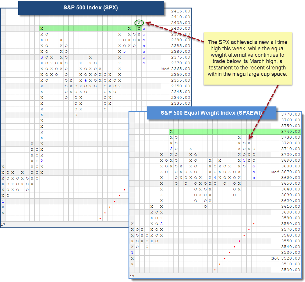
The major market bullish percent indicators, such as the Bullish Percent for NYSE stocks ^BPYNSE and the Bullish Percent for Optionable stocks ^BPOPTI remain in Os, since reversing down in late March. A column of Os on these indicators tell us we should be more defensive in our approach to portfolio management. Furthering the case for "defense," just a few weeks ago we moved into what is historically regarded as the "seasonally weak" 6-month stretch for the market. Yet, on Tuesday of this week, we saw the market (as defined by the S&P 500 Index SPX) move once again into uncharted territory with a new high at 2405. How can it be?
For those of you who have been subscribers for several years, this may stir up a sense of déjà vu, as we have been here before. Think back to the market from 2013 through 2014. The bullish percent charts formed patterns of lower tops and lower lows, all the while the major market indices continued to better their highs along the way. Separating the concept of participation from performance is the first step in understanding "how" this can be.
The bullish percent indicators measure participation, literally providing a reading that corresponds to the percent of stocks on buy signals within a specific universe. Each stock is treated equally, which is to say a buy signal from Apple AAPL counts no more or no less than a buy signal from any other stock in the universe. Meanwhile, major market indices such as the SPX or the Dow Jones DJIA measure price change or "performance" of their underlying stock components. However, in this case, the stocks are not "equally weighted;" and so a price change in a stock such as AAPL contributes to a greater extent than a name like Texas Instruments TXN. In fact, in the case of the SPX, a price change in AAPL actually contributes ten-times as much as a price change in TXN to the index as a whole.
With the differentiation made between participation and performance, we can understand that declining participation (a column of Os in the BP) does not have to equal a decline in performance (negative return in an index). It all depends on which stocks are no longer participating to the upside, and the extent to which they affect the major indices. To help visualize this concept further, consider the two charts below. On the left we see the S&P 500 Index SPX, and the equal weight alternative SPXEWI is on the right. Notice that the SPXEWI has not been able to better its March high. However, the SPX accomplished that feat on Tuesday (visible on its 5-point chart below), telling us that there are individual stocks - presumably with a greater market cap and thus larger weighting in the SPX - that are driving the new highs.

| Symbol | Name | Price | Yield | Trend | RS Signal | RS Col. | Score | 200 Day MA | Weekly Mom |
| DIA | SPDR Dow Jones Industrial Average ETF Trust | 209.95 | 2.19 | Positive | X | 3.37 | 195.23 | +3W | |
| EFA | iShares MSCI EAFE ETF | 65.99 | 2.68 | Positive | Sell | O | 3.40 | 59.63 | +3W |
| FRN | Guggenheim Frontier Markets ETF | 13.62 | 3.45 | Negative | Sell | O | 3.08 | 12.18 | +3W |
| IJH | iShares S&P MidCap 400 Index Fund | 172.53 | 1.53 | Positive | Buy | X | 4.22 | 163.43 | +4W |
| IJR | iShares S&P SmallCap 600 Index Fund | 69.28 | 2.13 | Positive | Buy | X | 4.80 | 65.91 | +4W |
| QQQ | PowerShares QQQ Trust | 139.62 | 0.87 | Positive | Buy | X | 5.83 | 123.38 | +4W |
| RSP | Guggenheim S&P 500 Equal Weight ETF | 91.45 | 1.08 | Positive | Buy | X | 4.83 | 86.90 | +3W |
| SPY | SPDR S&P 500 ETF Trust | 240.08 | 1.88 | Positive | O | 3.16 | 225.29 | +3W | |
| VWO | Vanguard FTSE Emerging Markets ETF | 41.35 | 2.21 | Positive | Sell | O | 4.45 | 38.02 | +1W |
| XLG | Guggenheim S&P 500 Top 50 ETF | 170.57 | 1.82 | Positive | O | 3.38 | 159.02 | +3W |
Despite the sell off we are experiencing today, the last week of market activity has been generally positive, with eight of the major market ETFs moving higher and just two falling (from 5/9 - 5/16). The biggest upside movers, all gaining over +1%, were the international focused funds in the list: EFA, FRN, and VWO. It was the Vanguard FTSE Emerging Markets ETF VWO that pushed ahead of the others, up 2.33% on the week.
It is no secret that International Equities as a whole have asserted leadership over the last several months, with the Emerging Market segment to thank in large part. A look at the 0.25-point trend chart of VWO below reveals a bullish pattern of higher tops and higher bottoms that has persisted for about five months. It is currently trading at levels not seen in about two years, and does so with a solid fund score of 4.45. In fact, as you will read below, the Emerging Markets Diversified group score sits at the top of all Macro Groups, with an average score of 4.22. In addition, the recent change back to positive weekly momentum, after ten weeks on the negative side, suggests the potential for additional upside within this segment, especially in the coming weeks.

(The DWA Technical Indicator link, found under the Indicators menu, provides valuable insight into where positive relative strength readings and positive trend charts are concentrated. RSX is the percentage of stocks within a sector whose relative strength charts are in a column of Xs. RSP is the percentage of stocks within a sector whose relative strength charts are on a buy signal. PT is the percentage of stocks within a sector that are trading above their bullish support lines and the overall trend is positive. The strongest sectors, i.e. market leaders, will have most of these indicators positive and moving higher in a column of Xs.)
Over the past week of trading, there were eight sector ^BP charts that moved higher while six fell. The Bullish Percent for Forest Prods/Paper ^BPFORE reversed down into O’s and moved to Bear Alert status. The Bullish Percent for the Real Estate sector ^BPREAL is within 1% of a reversal down into O’s. The average sector ^BP reading is 57.67%, down 0.34% from last week. There were three changes on the Favored Sector Spectrum over the past week. The Insurance sector remains Favored but lost a sector attribute as the ^PTINSU reversed down into O’s. Textiles moved up to Average from Unfavored as a result of the ^RSXTEXT moving back into a column of X's. The Forest Prods/Paper sector fell from Favored to Average as a result of the reversal into O’s on the ^PTFORE.
| Bear Alert |
|---|
| Forest Prods/Paper (60 O) |
| To Xs | To Os |
|---|---|
| None | Real Estate ( 0.37 to 58 ) |
The average Bullish Percent reading this week is 57.67% down 0.34% from the previous week
| 0-14 | 16-20 | 22-26 | 28-32 | 34-36 | 38-42 | 44-46 | 48-52 | 54-56 | 58-62 | 64-66 | 68-72 | 74-78 | 80-86 | 88-100 |
 |
||||||||||||||
| Sector |
|---|
| Precious Metals (28%) - Bear Confirmed |
| Sector |
|---|
| Retailing (44%) - Bear Correction |
| Sector |
|---|
| Aerospace Airline (64%) - Bear Confirmed |
| Banks (74%) - Bull Confirmed |
| Computers (56%) - Bull Correction |
| Electronics (54%) - Bull Correction |
| Finance (62%) - Bull Correction |
| Forest Prods/Paper (60%) - Bear Alert |
| Utilities / Gas (56%) - Bear Alert |
| Insurance (68%) - Bear Alert |
| Media (52%) - Bull Correction |
| Waste Management (56%) - Bear Confirmed |
PERCENT RELATIVE STRENGTH & POSITIVE TREND UPDATE
(The DWA Technical Indicator link, found under the Database tab, provides valuable insight into where positive relative strength readings and positive trend charts are concentrated. RSX is the percentage of stocks within a sector whose relative strength charts are in a column of Xs. RSP is the percentage of stocks within a sector whose relative strength charts are on a buy signal. PT is the percentage of stocks within a sector that are trading above their bullish support lines and the overall trend is positive. The strongest sectors, i.e. market leaders, will have most of these indicators positive and moving higher in a column of Xs.)
|
|
| ^PT Charts Reversing Up - | ^PT Charts Reversing Down - |
|
|
|
| ^PT Charts Moving Higher - | ^PT Charts Moving Lower - |
|
|
|
|
|
| ^RSX Charts Reversing Up - | ^RSX Charts Reversing Down - |
|
|
|
| ^RSX Charts Moving Higher - | ^RSX Charts Moving Lower - |
|
|
| ^RSP Charts Reversing Up - | ^RSP Charts Reversing Down - |
|
|
|
| ^RSP Charts Moving Higher - | ^RSP Charts Moving Lower - |
|
|
FAVORED SECTORS LIST
Favored Sectors are those that have three of the four charts (Relative Strength, RSX, RSP, and PT) positive. The table below contains those sectors which changed their favored status over the past week. It is best to focus on those sectors that are about 50% or lower on their Bullish Percent Readings and in a column of Xs on the bullish percent chart. Should a sector move from Favored to Average, that doesn't mean the sector has to be sold.
| Changes since 05/10/2017 |
|
|
|
|
|||||
|
|
|
|
|
|
|||
|
|
|
|
|
|
|||
|
|
|
|
|
|
|||

You will recall that last week, the Emerging Markets Diversified group saw its average score break above the 4-threshold, pushing it into the “blue zone” for the first time since April 26th, 2011. With yesterday’s market action, the group was able to achieve the title of highest scoring Macro group, with an average score of 4.22. This move allowed it to surpass both the US All Small Cap (4.15) and the Equal Weight Asset (4.07) Macro groups, which are also in the strong “blue zone”. Notice the S&P 500 Index Funds group is currently found in the “green zone” with a score of 3.94, just below the Cap Weighted Asset group (4.00).
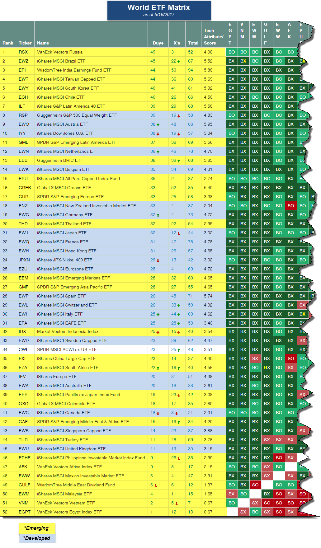
This is the highest average score the Emerging Markets Diversified group has achieved since January 27th, 2011, when it was on its way down from above 5.00. The positive score direction of 2.18, speakings to the recent improvement for the group as well. We can visualize the strength in emerging markets beyond just the fund score averages, as well. Take for instance the World ETF matrix, a premade matrix available under the matrix tool, and shown below. This is a matrix comprised of 52 individual Emerging and Developed funds, including the SPDR MSCI ACWI ex-US ETF CWI. Below we have highlighted the Emerging funds in yellow and the Developed funds in blue. Notice that the top decile of the matrix is made up purely Emerging market funds. Currently, Russia is demonstrating the strongest relative strength followed by Brazil, India, and Taiwan.


Remember, these are technical comments only. Just as you must be aware of fundamental data for the stocks we recommend based on technical criteria in the report, so too must you be aware of important data regarding delivery, market moving government releases, and other factors that may influence commodity pricing. We try to limit our technical comments to the most actively traded contracts in advance of delivery, but some contracts trade actively right up to delivery while others taper off well in advance. Be sure you check your dates before trading these contracts. For questions regarding this section or additional coverage of commodities email ben.jones@dorseywright.com.
Data represented in the table below is through 5/16/2017:
Broad Market Commodities Report
| Symbol | Name | Price | Trend | RS Signal | RS Col. | 200 Day MA | Weekly Mom |
| CL/ | Crude Oil Continuous | 48.59 | Negative | Buy | X | 49.15 | -3W |
| DBLCIX | Deutsche Bank Liquid Commodities Index | 306.70 | Negative | Sell | O | 315.10 | -3W |
| DWACOMMOD | DWA Continuous Commodity Index | 454.59 | Negative | Sell | O | 450.21 | +1W |
| GC/ | Gold Continuous | 1236.80 | Positive | Buy | O | 1251.44 | -3W |
| GN/Y | S&P GSCI Index Spot | 381.77 | Negative | Sell | O | 377.70 | -3W |
| HG/ | Copper Continuous | 2.55 | Positive | Sell | X | 2.44 | -14W |
| ZG/ | Corn (Electronic Day Session) Continuous | 367.75 | Positive | Sell | O | 350.57 | -1W |
| Links to Additional Summaries |
In yesterday’s “Were You Aware…?” we noted that the NYCE U.S. Dollar Index Spot DX/Y had fallen to give a third consecutive sell signal since the January peak, and also violated the bullish support line. The Dollar’s near-term weakness is not a new story, and from a relative standpoint the U.S. Dollar group in DALI has ranked 2nd (out of 3) since March of last year. The one group that ranks above the U.S. Dollar group in DALI is Emerging Currencies. For more perspective on the recent trends of broad Emerging Currencies today we want to take a look at the chart of the WisdomTree Dreyfus Emerging Currency Fund CEW. Since bottoming at $15.75 in August of 2015, CEW has rallied to give three consecutive buy signals. The most recent buy signal occurred at $18.50 in April, causing the Fund to move back into a positive trend. This is the first time since December 2014 that the chart has been in a positive trend, and the Fund is trading at levels that have not been seen since July of 2015. Year-to-date, CEW is up 6.75%, while the U.S. Dollar, represented by the PowerShares DB U.S. Dollar Index Bullish Fund UUP, has lost 4.20%. At this time, CEW has a fund score of 3.61, which is higher than the average score for funds within the Global Currency group at 1.85. Additionally, with a 3.61 score, CEW is the second highest scoring currency-related ETF in the DWA system, just behind the Brazilian Real (3.71) and Bitcoin (6.00). While the broader Currency asset class sits in last place in our DALI asset class rankings, and remains out of favor, CEW presents a fairly sound technical picture and could be consider by those who may be looking for a currency hedge or alternatives exposure.

The Distribution Report below places Major Market ETFs and Indices into a bell curve style table based upon their current location on their 10-week trading band. The middle of the bell curve represents areas of the market that are "normally" distributed, with the far right being 100% overbought on a weekly distribution and the far left being 100% oversold on a weekly distribution. The weekly distribution ranges are calculated at the end of each week, while the placement within that range will fluctuate during the week. In addition to information regarding the statistical distribution of these market indexes, a symbol that is in UPPER CASE indicates that the RS chart is on a Buy Signal. If the symbol is dark Green then the stock is on a Point & Figure buy signal, and if the symbol is bright Red then it is on a Point & Figure sell signal.
The average Bullish Percent reading this week is 57.67% down 0.34% from the previous week
| <--100 | -100--80 | -80--60 | -60--40 | -40--20 | -20-0 | 0-20 | 20-40 | 40-60 | 60-80 | 80-100 | 100-> | |||
|
||||||||||||||
| Symbol | Name | Symbol | Name |
| AGG | iShares US Core Bond ETF | NASD | Nasdaq Composite |
| CL/ | Crude Oil Continuous | NDX | NASDAQ-100 Index |
| DJIA | Dow Jones Industrial Average | RSP | Guggenheim S&P 500 Equal Weight ETF |
| DVY | iShares Dow Jones Select Dividend Index | RUT | Russell 2000 Index |
| DX/Y | NYCE U.S.Dollar Index Spot | SHY | iShares Barclays 1-3 Year Tres. Bond Fund |
| EFA | iSharesMSCI EAFE Index Fund | SML | S&P 600 Small Cap Index |
| FXE | CurrencyShares Euro Trust | SPX | S & P 500 Index |
| GC/ | Gold Continuous | TLT | iShares Barclays 20+ Year Treasury Bond Fund |
| GSG | iShares S&P GSCI Commodity-Indexed Trust | UV/Y | Continuous Commodity Index |
| HYG | iShares iBoxx $ High Yield Corporate Bond ETF | VOOG | Vanguard S&P 500 Growth ETF |
| ICF | iShares Cohen & Steers Realty Index | VOOV | Vanguard S&P 500 Value ETF |
| IEF | iShares Barclays 7-10 Yr. Tres. Bond Fund | VWO | Vanguard FTSE Emerging Markets ETF |
| LQD | iShares iBoxx $ Investment Grade Corp. | XLG | Guggenheim S&P 500 Top 50 ETF |
| MID | S&P 400 MidCap Index |
In the Optionable Universe, this week we saw 10 relative strength buy signals compared to 13 last week. On the sell side, there were 7 relative strength sell signals compared to 21 last week.
| Symbol | Company | Sector | Price | RS vs Market Signal | RS vs Market Column | RS vs Peer Signal | RS vs Peer Column | Trend |
|---|---|---|---|---|---|---|---|---|
| AFAM | Almost Family, Inc. | Healthcare Providers | 56.750 | Buy | X | Sell | X | 4 |
| LPSN | LivePerson, Inc. | Technology Services | 9.900 | Buy | X | Sell | X | 3 |
| MCHP | Microchip Technology Incorporated | Semiconductors | 81.630 | Buy | X | Sell | X | 3 |
| PCRX | Pacira Pharmaceuticals Inc | Pharmaceuticals | 50.450 | Buy | X | Buy | X | 5 |
| RAIL | FreightCar America, Inc. | Industrial Goods & Svcs | 17.510 | Buy | X | Buy | X | 5 |
| RGEN | Repligen Corp | Biotechnology | 39.720 | Buy | X | Buy | X | 5 |
| TTEC | TeleTech Holdings, Inc. | Industrial Goods & Svcs | 38.200 | Buy | X | Buy | X | 5 |
| XLNX | Xilinx, Inc. | Semiconductors | 65.460 | Buy | X | Sell | X | 3 |
| SORL | Sorl Auto Parts Inc. | Automobiles | 5.970 | Buy | X | Buy | X | 5 |
| BABA | Alibaba Group Holding Ltd (China) ADR | Retail | 124.020 | Buy | X | Sell | X | 3 |
| Symbol | Company | Sector | Price | RS vs Market Signal | RS vs Market Column | RS vs Peer Signal | RS vs Peer Column | Trend |
|---|---|---|---|---|---|---|---|---|
| BXP | Boston Properties | Equity REITs | 120.890 | Sell | O | Buy | O | 1 |
| DKS | Dick's Sporting Goods, Inc. | Retail | 41.040 | Sell | O | Sell | O | 0 |
| LAYN | Layne Christensen Co. | Industrial Goods & Svcs | 7.780 | Sell | O | Buy | O | 2 |
| NNN | National Retail Properties, Inc. | Equity REITs | 36.720 | Sell | O | Buy | O | 1 |
| WLB | Westmoreland Coal Company | Coal | 7.930 | Sell | O | Buy | O | 1 |
| SN | Sanchez Energy Corp. | Oil Companies Major | 6.650 | Sell | O | Buy | O | 2 |
| SYF | Synchrony Financial | Financial Services | 26.840 | Sell | O | N/A | O | 1 |
| Comments |
|---|
| AKAO Achaogen, Inc ($24.90) - Biomedics/Genetics - AKAO broke a triple top at $27 on Wednesday, the fifth consecutive buy signal on the chart confirming that demand is in control. This stock is trading in a positive trend and is an acceptable 4 for 5’er within the favored Biomedics/Genetics sector. Weekly momentum just flipped positive, suggesting the potential for further upside from here. Okay to buy or hold here as the technical picture is positive. The first sign of trouble comes with a move to $21, a double bottom sell signal. |
| DIN DineEquity, Inc. ($49.17) - Restaurants - DIN broke a double bottom at $49, the third consecutive sell signal on the chart. DIN is a 0 for 5’er within the Restaurants sector that is trading well below the bearish resistance line and is showing weakness relative to both the market and its peers. Additionally, this stock ranks dead last in the Restaurants sector RS matrix. Supply is in control. Avoid. The first level of resistance is at $57. |
| ENS EnerSys ($79.78) - Electronics - After forming, but not breaking, a double top at $84, ENS broke a double bottom at $80 and fell further to $79. This break sets the chart up for a potential shakeout pattern. From here, the action point would be triggered with a reversal up into X’s while a triple top break at $85 would complete the pattern. ENS is a strong 4 for 5’er within the Electronics sector. Okay to play the pattern on the reversal up into X’s or upon completion at $85. A move to $77 would negate the pattern as that is the level in which the bullish support line would be violated. |
| GILD Gilead Sciences, Inc. ($64.52) - Biomedics/Genetics - GILD broke a triple bottom at $65 on Wednesday, making the fourth consecutive sell signal on the chart as well as a new 52 week low. This stock is an unacceptable 0 for 5’er within the Biomedics/Genetics sector that currently ranks 71st out of 82 names in the sector RS matrix. Additionally, the bearish price objective is $61, suggesting the potential for further downside from here. Avoid as supply is in control and there is no further support left on the chart. Resistance is at $69. |
| GOLD Randgold Resources Limited (United Kingdom) ADR ($96.56) - Precious Metals - GOLD broke a double top at $95 and rallied to $97. This stock is a 3 for 5’er within the Precious Metals sector that recently saw its monthly momentum flip positive, suggesting the potential for further upside from here. Demand is in control. Okay to initiate new positions here as the weight of the evidence is positive. Support is at $85, the bullish support line. Note resistance at $106 and $126. |
| NLNK Newlink Genetics Corp ($16.18) - Biomedics/Genetics - NLNK broke a double bottom at $16. This move violated the bullish support line and therefore downticked this to a weak 2 for 5’er. The bearish price objective is $7, suggesting the potential for further downside. Additionally, this stock ranks 62nd out of 82 names in the Biomedics/Genetics sector RS matrix. Avoid as supply is in control. Further support is afforded at $15.50 and $14 while resistance is at $20. |
| TOWR Tower International Inc ($23.85) - Autos and Parts - TOWR broke a triple bottom at $24. This move broke through the bullish support line, flipping the trend negative and downticking this name to a 1 for 5’er within the Autos and Parts sector. Monthly momentum just flipped negative, adding to the negative technical picture. Year-to-date, this stock is down -13.23% compared to SPX, up 7.23% (through 5/16). Supply is in control. Avoid. There is further support at $21 and $19. Note resistance at $30. |
| UFPI Universal Forest Products, Inc. ($89.37) - Forest Prods/Paper - With the most recent market action, UFPI broke a double bottom at $87 and fell further to $85. This move completes a bearish catapult pattern on the chart. UFPI is trading in a negative trend and is showing near term weakness to both the market and its peers, making it an unacceptable 2 for 5’er within the Forest Prods/Paper sector. Supply is in control and the technical picture is negative. Avoid. Additional support is afforded at $84 and $77. |
| WABC Westamerica Bancorporation ($51.73) - Banks - WABC broke a double bottom at $52 on Wednesday. This move violated the bullish support line, flipping the trend negative and downticking this stock to an unacceptable 0 for 5’er within the Banks sector. Monthly momentum has been negative for two months, suggesting the potential for further downside from here. Additionally, this stock ranks 110 out of 118 names in the Banks sector RS matrix, making this one of the weaker names within this space. Avoid. There is further support at $47-$48. |
| ZUMZ Zumiez Inc. ($15.58) - Retailing - ZUMZ broke a double bottom at $15.50. This stock is trading in a negative trend and is a weak 1 for 5’er within the unfavored Retailing sector. Furthermore, this stock ranks 74th out of 89 in the Retailing sector RS matrix. Additionally, monthly momentum has been negative for three months, suggesting the potential for further downside from here. Avoid as supply is in control and the technical picture is negative. Note earnings are slated for 5/31/17. |
| Name | Option Symbol | Action | Stop Loss |
|---|---|---|---|
| Cummins Inc. - $153.34 | O:CMI 17I150.00D15 | Buy the September 150.00 calls at 10.30 | 142.00 |
| Name | Option | Action |
|---|---|---|
| PowerShares QQQ Trust ( QQQ) | Jun. 114.00 Calls | Stopped at 23.00 (CP: 22.20) |
| Global Payments Inc. ( GPN) | May. 75.00 Calls | Stopped at 13.50 (CP: 13.00) |
| Citigroup, Inc. ( C) | May. 55.00 Calls | Stopped at 7.00 (CP: 4.95) |
| Crown Castle International Corp. ( CCI) | Oct. 87.50 Calls | Raise the stock price stop loss to 89.00 (CP: 98.17) |
| SunTrust Banks, Inc. ( STI) | Oct. 50.00 Calls | Stopped at 6.85 (CP: 5.45) |
| Name | Option Symbol | Action | Stop Loss |
|---|---|---|---|
| Capital One Financial Corporation - $78.48 | O:COF 17U80.00D15 | Buy the September 80.00 puts at 5.60 | 90.00 |
| Name | Option | Action |
|---|---|---|
| Manhattan Associates, Inc. (MANH) | Jul. 55.00 Puts | Stopped at 7.20 (CP: 6.40) |
| Gilead Sciences, Inc. (GILD) | Aug. 75.00 Puts | Initiate a stock price stop of 71.00 (CP: 64.81) |
| Macerich Co (MAC) | Sep. 70.00 Puts | Raise the option stop loss to 10.00 (CP: 12.80) |
| Name | Option Sym. | Call to Sell | Call Price | Investment for 500 Shares | Annual Called Rtn. | Annual Static Rtn. | Downside Protection |
|---|---|---|---|---|---|---|---|
| Lumber Liquidators Holdings Inc $26.70 | O:LL 17K30.00D17 | Nov. 30.00 | 1.75 | $12,112.00 | 45.10% | 12.10% | 5.70% |
| Name | Action |
|---|---|
| Micron Technology, Inc. (MU) - 29.02 | Sell the July 29.00 Calls. |
| Momo Inc (China) ADR (MOMO) - 43.82 | Sell the October 40.00 Calls. |
| TTM Technologies, Inc. (TTMI) - 16.57 | Sell the September 17.50 Calls. |
| The Chemours Company (CC) - 45.38 | Sell the October 44.00 Calls. |
| Lumentum Holdings Inc (LITE) - 56.55 | Sell the September 55.00 Calls. |
| Wynn Resorts, Limited (WYNN) - 127.91 | Sell the September 130.00 Calls. |
| Name | Covered Write |
|---|---|
| Tutor Perini Corporation ( TPC - 27.55 ) | October 30.00 covered write. |
| Medidata Solutions, Inc. ( MDSO - 70.35 ) | October 75.00 covered write. |
Daily Equity & Market Analysis
Loading, Please Wait...
