
Gold prices are still hovering around multiyear chart highs. Today, we unpack a couple of reasons why we think this is the case.
Gold (GC/) is still getting a fair amount of attention from the investment community, and rightfully so, it remains near multiyear highs despite a prolonged equity rally and recent breakout from interest rates. Although, it feels a bit polarizing (at least anecdotally) – people seem to think gold will either come crashing down or break out to fresh highs with flying colors, and each party thinks the other is crazy.
Admittedly, the market is made up of people acting irrationally, but at the same time, it tends to be quite efficient. So, it pays to understand the other side of a trade. Today we will unpack two reasons why we think gold is still sitting near its chart highs, which could then inform how to position portfolios. We will start with a shorter-term case and conclude with a longer-term case.

Shorter-Term Case: Protection
There are various benefits to owning gold, but one of the most cited reasons is protection; in fact, gold is often outright labeled as a “safe haven” asset. Now, whether the performance numbers hold to that belief across all types of market environments is up for debate, but based on the averages, it tends to hold true. That said, after a historic start to the year for equities many strategists have recently come out with expectations for a “pullback” of some sort in the coming months, mentioning seasonality as a notable headwind along with persistently overbought conditions. We too have echoed these thoughts in recent podcasts, morning update videos, and reports.
While traditional, calendar year seasonality is against equity prices for the next couple of months, presidential election cycle seasonality is in favor of gold. The line chart below and the corresponding return table further this point.
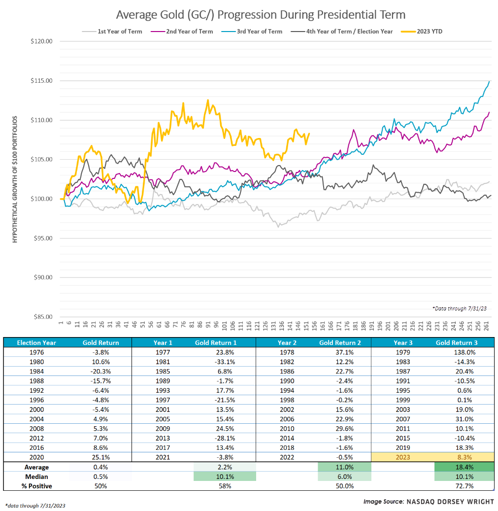
As we can see, gold tends to perform well in the third year of a president’s term, especially in the final stretch of the year. To those who looked closely at the performance table above and noticed the 138% gain in 1979 skewing the returns, even when removing that data point gold averaged a 6.4% gain and was positive 70% of the time. So, the seasonal strength of gold and seasonal weakness for equities, from a calendar and presidential cycle perspective, seem to agree in providing a near-term technical case for gold.
Longer-Term Case: Declining Real Yields
Expectations for inflation and interest rates could also be buoying gold prices. To streamline this discussion today we will talk about real yields, which combine the two topics by reflecting the inflation-adjusted cost of funds to a borrower and/or yield to a lender. A real interest rate can be simply calculated by taking the nominal interest rate and subtracting the rate of inflation (expected or actual).
Declining real yields make bonds less attractive and make other stores of wealth, especially those with values that tend to increase with inflation, more attractive. Of course, the reverse is also true, when real yields increase, it makes bonds more attractive relative to assets that don’t produce any income. In April of this year, we produced a piece on the relationship between real yields and precious metals, and just last week we wrote an update that highlighted gold’s negative correlation with treasury yields.
With all that in mind, gold investors could be expecting a decline in real yields. Potential reasons backing this expectation would be the recent broad-based advance from commodities (like crude oil, agriculture, and copper), which fuels inflation, in addition to forward expectations for monetary policy. Rate hike probabilities (based on Fed futures) have subsided since the last Fed meeting and treasury yields are fighting with firm areas of resistance, in addition to being overextended in the near-term based on their ten-week trading band.
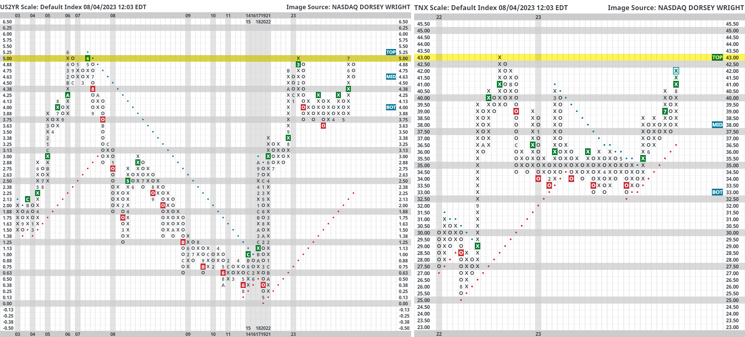
For example, the US 2 Year Yield (US2YR) reversed down into Os on its default Point & Figure chart last month from a multi-decade high of 5%. Although not talked about as frequently, resistance is also very clear on the US 5 Year chart (FVX). The US 10 Year Yield (TNX) got within one box of its multi-decade high at 4.3% (from October of 2022) yet now sits just one box away from reversing down into Os. Also, the US 30 Year Yield (TYX) got within two boxes of its multi-decade highs at 4.4% and now carries its highest weekly overbought (OBOS) reading since October 2022.
We do not discuss fund flows in our commentary very often, but to conclude our piece today we wanted to add a chart from BofA Global Research showing inflows for TIPS (Treasury Inflation-Protected Securities). As written atop the chart, TIPS recently registered their first inflow since August of 2022 which suggests a pickup in investor demand. Although this is currently just a blip on a chart, hopefully it underscores our shorter-term and longer-term points today as to why gold may be hanging around its all-time highs. Furthermore, ideally the passionate gold investors can understand the other side of a well-documented battle going on in the market right now.

