
We take a look at market trends through the lens of the quadrant analysis tool.
As interest rates continue to fall across the board, we have seen a multitude of fixed income groups on the Asset Class Group Scores page with funds scores exceeding 4.00. The recent run-up in major domestic equity indices have taken the lion’s share of attention over the past few months, but from an overall market standpoint, there is still an appetite for risk-off assets. A great way to visually see this is through the quadrant analysis tool. Simply put, this tool allows us to see for how much risk is taken, what kind of score we get in return. On the x-axis is rRisk (relative risk), and on the y-axis is average group score. The origin of this graph is where rRisk is 1, the rRisk of the market, and the 3.00 average group score meet. By graphing each group, we can visualize overall trends in the market.

Looking at the image above, we have a quadrant analysis of all the macro groups. The axes lines are in red and each quadrant is labeled 1-4. Groups within quadrant one exhibit a fund score above 3.00 and an rRisk above 1. These groups are viewed as having high relative strength coupled with higher risk and can be viewed as options for the aggressive portion of an allocation strategy. Groups that find themselves within quadrant two are quality assets that maintain a score above 3.00 and an rRisk of less than 1, offering assets that can provide a strong basis for asset allocation. Quadrants three and four offer groups with scores below 3.00 and are a good place to look for potential ideas that aren’t actionable yet, particularly groups that possess positive score directions closing in on the 3.00 threshold. A good example is the Latin America group, which was touched on in-depth in yesterday’s Fund Score Overview.
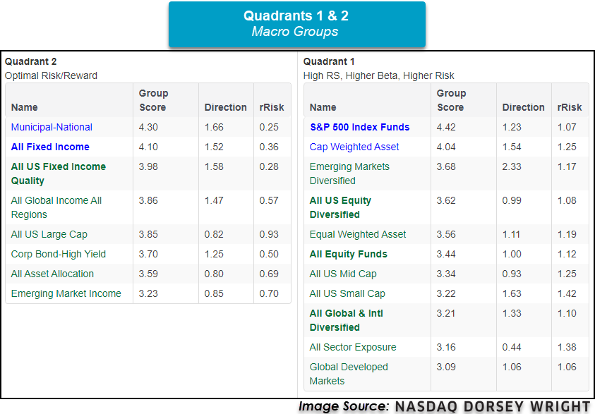
Putting this all together is the blue line on the quadrant analysis graph. This blue line is the line of best fit given all the groups currently graphed. While this seems complex, the most important thing is the slope of the line. If the slope is positive it implies that the more risk taken in the market, the higher the group score. If the slope is negative, then the less risk taken in the market, the higher the group score. By looking at the slope of this line, we can get a general idea of market conditions and determine whether the market is in a risk-on or risk-off environment. The current slope of the macro group’s line of best fit is -0.44, suggesting the market is still in a risk-off mode even with the rally in equities since March. This is exemplified by groups that fall under the fixed income umbrella as 24 fixed income groups possess scores above the coveted 4.00 mark. As both fixed income and domestic equity groups continue to broadly exhibit strength, it’s important to continue to monitor both and allocate accordingly.
