The spread between top performing energy & worst performing financials sits at just over 30%- its widest in quite a few years. We explore what this could mean going forwards and RS changes you need to be aware of.
If you ask the analyst team their favorite “visual” on the NDW platform, you will get a few different answers. For many, the visual simplicity of the DALI page offers high level commentary about the state of markets around the world. For others, a clean shakeout pattern for a 5/5’er is a picture fit for the Louvre. Not talked about frequently enough is the quilt function, which allows you to stack a custom list of names (or one of NDW’s premade options…) into a list and see performance metrics across the years in one place. For the sake of today’s feature we will analyze the dispersion in performance between the various sectors, which has certainly given us plenty to talk about so far in 2026. In fact, the quilt below details 2026’s sector performance- standing nearly at direct odds with overall trends we saw in 2023-2025. Towards the top of the heap sit energy, basic materials, & staples, groups which typically produce around weaker market environments. On the bottom, the likes of financials, technology, & discretionary paint a bleak story for those rooting for economic growth. In fact, the start to 2026 looks particularly similar to the full 2022 calendar year, a year hindsight tells us was a particularly bleak market on the domestic front.

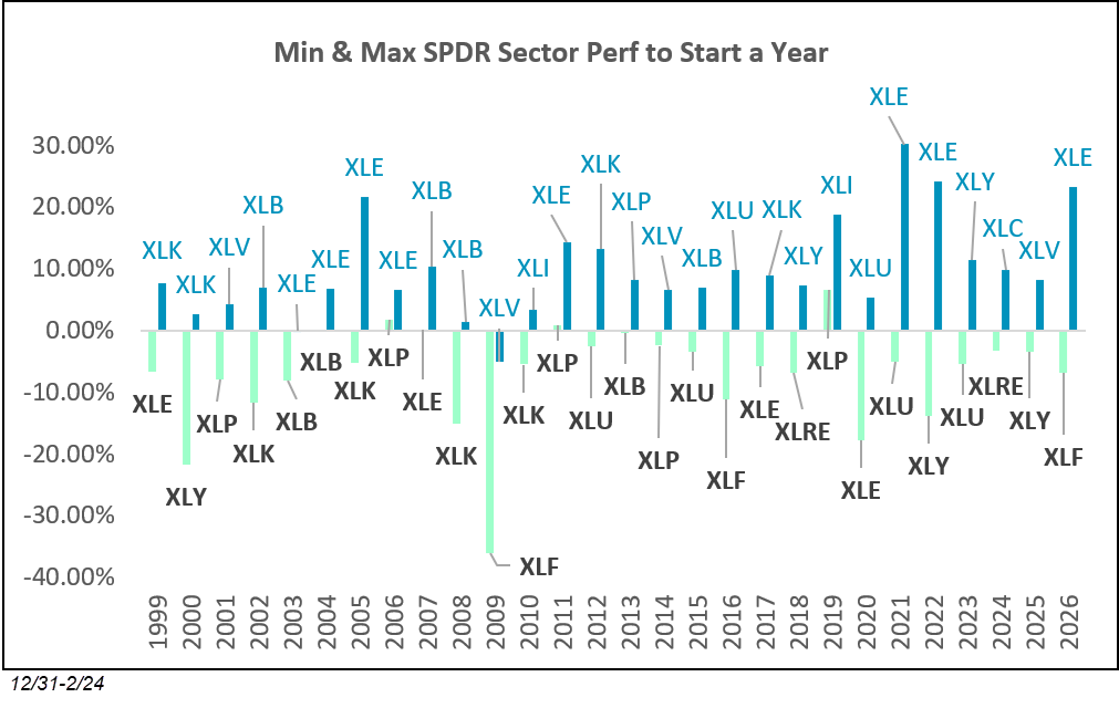
While the quilt is certainly useful, there is a lot going on. For this reason, we can isolate the best and worst performing funds each year in an effort to measure the dispersion between winners and losers. This dispersion is particularly important because as trendfollowers, a wider range of outcomes typically allows us to pinpoint specific points of strength and underweight those weak areas. The chart below does just that, measuring a ~30% dispersion between best performing Energy (XLE, +23.24%) and Financials (XLF, -6.92%) through 2/24/2026. This spread between our best and worst fund is the widest to start a year since 2022 and the third largest in our observed history going back to 1999. Interestingly enough, the other two higher dispersion years (2021 & 2022) both saw energy lead the way in a similar fashion to 2026. The dataset is admittedly quite small, but there doesn’t seem to be a discernible performance trend following such wide leadership for energy… markets rebounded quite nicely (while energy lagged) in 2021 while such leadership persisted in 2022 while broader markets suffered.
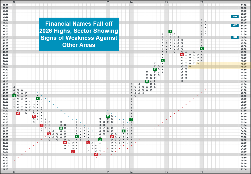
Lots of recent research has touched on the strength of energy. We are just now seeing the sector enter into a handful of NDW models, but many representatives are in what we would consider heavily overbought territory around current levels. Much less research has discussed the decline of financial names, with much of the sector sitting well off their respective highs. Even some of the major blue blood bank stocks like JPM, BAC or WFC has struggled materially so far this year. Most of the larger names retain their strong technical attribute ratings… but many have posted consecutive sell signals and established some significant resistance overhead. While there certainly is an argument that exposure towards the group is still warranted, do exercise significant caution with current holdings. Consider setting alerts for notable breaks of support or further loss of technical favor as a sign of persistent weakness. XLF is now flirting with “unfavorable” territory according to its fund score, and while it still maintains a buy signal on its chart sits without technical support until the mid-$40’s. We are currently trading in heavily oversold territory and around a range of old resistance around current levels, so a near-term bounce could be in store. Regardless, keep a close eye on the sector as the recent decline is certainly quite notable.