
Despite a rather euphoric week for investors, it is not all sunshine and rainbows. The copper-gold ratio sheds some light.
Equity and bond markets had another tremendous week. Most notably, the Russell 2000 (RUT) led the pack with a gain of 5.55% and the S&P 500 (SPX) added 2.49% to extend its weekly win streak to seven.
The bulk of market action this week came on Wednesday afternoon as the Fed wrapped up its December meeting, leaving rates unchanged as had widely been expected. Yields fell significantly following the meeting with the US Treasury 10YR Yield Index (TNX) and 30YR Yield Index (TYX) each breaking into negative Point & Figure trends.
The impetus for the rally in bonds (and equities) appeared to be the Fed’s statement of economic projections which showed FOMC’s median projection for the level of the Fed Funds in 2024 had fallen to 4.6%, down from 5.1% in September, implying roughly 75 basis points of cuts next year. While this is less than the 100-125 basis points of cuts the market had been pricing in, it shows that Fed officials do foresee lowering rates next year.
The Dow hit an all-time high this week and other major indices are not far off. Due to the widespread and aggressive advance, many of our technical indicators now sit in historically high field positions – and because sentiment tends to follow price, euphoria could be creeping into the minds of investors.
Howard Marks, American investor and co-founder of Oaktree Capital Management famously described the pendulum effect in markets, and Robert Kirby, an investment adviser in the late 1990s, gave one of the better interpretations:
“Long ago, I began to look at the stock market as a kind of pendulum swinging back and forth with no discernible pattern or rhythm. It swings between three o’clock on one side and nine o’clock on the other. At three o’clock, fear takes over and it’s full panic. At nine o’clock, greed takes over and it’s full manic. At six o’clock there’s a point where logic and balance exist and where valuations make a lot of sense to most rational people. Unfortunately, the pendulum doesn’t spend much time at six o’clock.”
One thing that could cause the current market pendulum (clock in the analogy above) to swing back in the other direction is an answer to a rather simple question: why are interest rates (and expectations for rates) coming down so quickly? We will share our thoughts with a few charts, per usual.
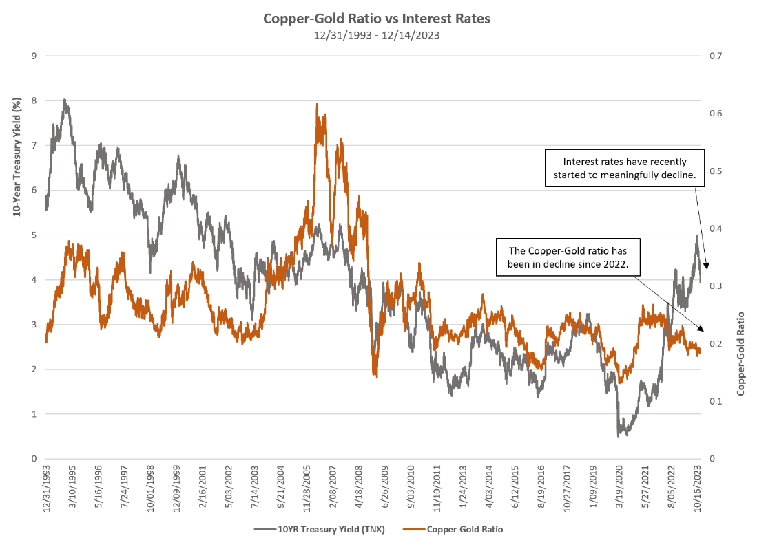
The copper-gold ratio (orange line in the image above) simply takes the price of copper (HG/), divides it by the price of gold (GC/), and plots the reading daily – very similar to our relative strength Point & Figure charts. When the ratio is rising that means copper is outperforming gold and when the ratio is falling that means gold is outperforming copper.
What is the significance? Gold is considered a safe haven for investors, and with far fewer industrial/economic uses, its role as a store of value is further emphasized. Rising gold prices have often signaled economic contraction and/or investor fear. Conversely, copper is a key industrial metal with countless economic applications, especially in building construction and electronics. Thus, copper tends to perform well when the economy is strong and/or when the economy is expected to be strong.
The grey line on the chart above is the US Treasury 10YR Yield (TNX). As we can see, interest rates tend to run parallel with the copper-gold ratio. Intuitively this makes sense because rising interest rates typically come during economic expansions and falling interest rates are often characteristic of accommodative monetary action taken during times of economic hardship.
The takeaway today is that the copper-gold ratio has been in a downtrend since early 2022 and is currently showing no technical signs of turning around. Interest rates have recently started to meaningfully decline and run parallel with the copper-gold ratio, which is in line with expectations.

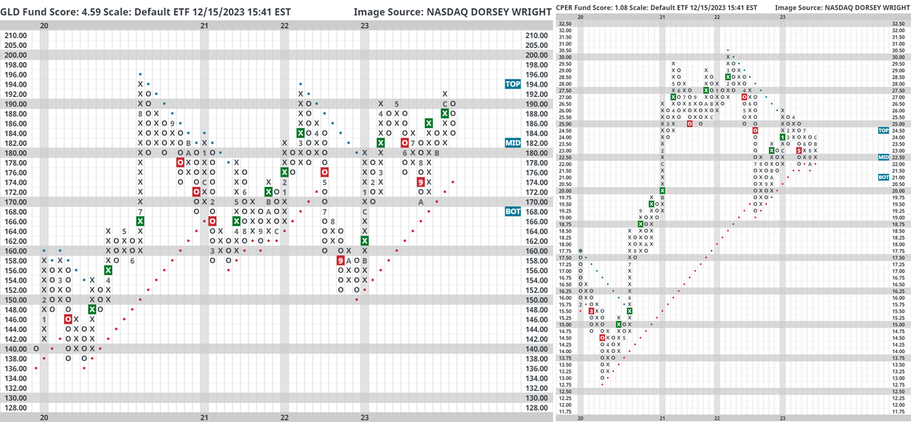
As it relates to equities, consider the image above. We constructed a relative strength chart between the United States Copper Index Fund (CPER) and the SPDR Gold Trust (GLD) on a 3.25% scale, which simply means that each column change (into either Xs or Os) requires about 10% of outperformance. When this chart is in Xs CPER is outperforming and when the chart is in Os GLD is outperforming. The buy/sell signals (green and red boxes, respectively) are objective long-term indications of relative price strength while the columns Xs/Os indicate shorter-term trends of relative price strength.
We also computed performance for the S&P 500 via cap weight ETF (SPY) and equal weight ETF (RSP). Note: before ETF inception we used underlying index data. While CPER was on a relative strength buy signal against GLD (green box on the chart) SPY generated an average return of 31.75% and a median return of 27.93%. While CPER was on a relative strength sell signal against GLD (red box on the chart) SPY generated an average return of 7.85% and median return of 15.02% - which is not bad, but materially lower than when on a buy signal. We observe similar performance patterns for RSP. The point being – we should want to see this turnaround in favor of copper.
Gold sits just shy of its all-time chart highs while copper is still trying to fight its way out of a downtrend that has been in place since April of 2022.
There will never be an “all clear” signal when investing and no two markets are the same. After all, there were plenty of periods in the table above where equities continued to perform well amidst relatively weak copper prices. The market is forward looking they say. So, simply consider today’s piece to be a conversation starter and perhaps serve as a reminder that after a rather euphoric week, it is not all sunshine and rainbows…especially in light of what investors may be inadvertently cheering for as interest rates (and expectations) plummet.
