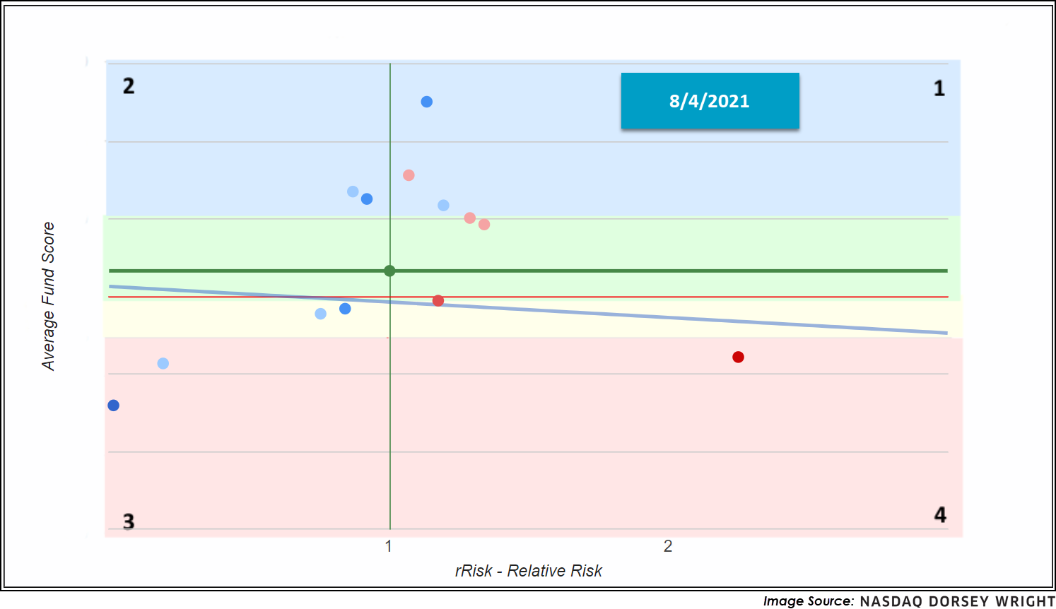
Through close examination of the quadrant graph, we notice a quiet shift in sector trends
Beginners Series Webinar: Join us on Friday, August 6th, at 2 PM (ET) for our NDW Beginners Series Webinar. This week's topic is Individual Stock Idea Generation. Register Here
The S&P 500 Index Funds Group dropped from the top rank on the Asset Class Group Scores Page; however, it remains in the 97th percentile. This prolonged and historic strength from the domestic benchmark can easily mute the sector shifts taking place beneath the surface. So, to help pinpoint these trends more closely, we used the quadrant graph.
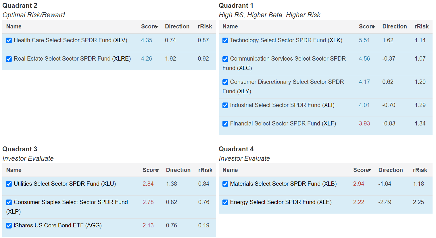
As a reminder, the quadrant graph is particularly useful for gaining a visual perspective on the relative strength/relative risk profile of a fund group. The two-dimensional graph, like any other, has an X and Y axis, with the former representing rRisk and the latter representing fund score - an rRisk of 1 matches the 3-year monthly standard deviation of the S&P 500, and a fund score of (3.00+) is considered technically acceptable. Keep in mind that fund scores will increase when the security performs well and decrease when the security performs poorly (like other momentum rankings). As a result, optimal quadrants include 2, which indicates low relative risk and high relative strength, as well as 1, which indicates high relative risk and high relative strength.
When grouping a set of funds, like we did below with the State Street SPDR Sector ETFs, we can summarize this trend, or demand sentiment, through the slope. A positive slope tells us that higher risk investments are being rewarded with higher returns (risk-on) while a negative slope says that lower risk investments are demonstrating greater price resilience (risk-off).

Perhaps of greater use is the ability to compare points in time. Shown above is the snapshot of the SPDR Sector quadrant graph from June (6/4) while the below snapshot is yesterday's (8/4) setup. Notice that we are also using the Doppler RS view, which tells us the intensity of the score directions/movements of the funds at the time. Two months ago, we had a positive slope and an environment where higher rRisk groups were being rewarded, but now (8/4) we have a negative slope, indicating that lower rRisk areas have held up better. Although the current slope is not strongly negative, it should tip us of shifts taking place in the underlying market environment, which can be masked by the major indices hitting all-time highs week after week.