Copper moved higher against gold recently, earning positive relative strength. We observe copper vs. gold in a vacuum before zooming out and comparing both to the broad market.
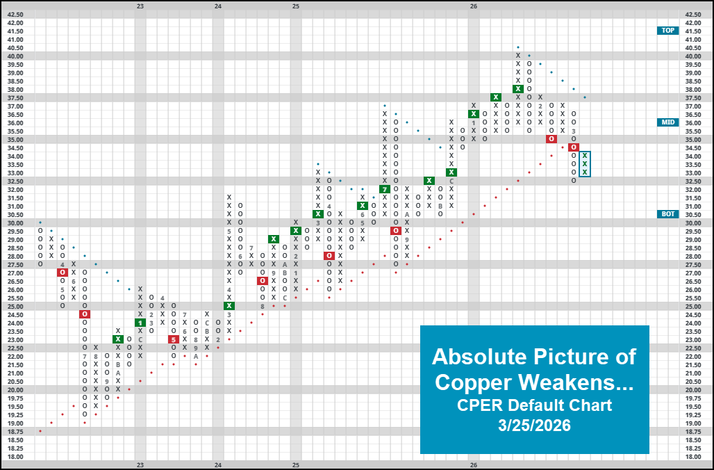
Lots of recent research has detailed some emerging relative weakness stemming from the precious metals space. While positive action on 3/25 driven largely by a possible near-term ceasefire in the Middle East sent global markets higher for the day, there is no question from looking at individual precious metal technical pictures that the space is struggling. To add to that picture today, we will highlight a recent RS change between copper & gold. Before going further, its worth mentioning that the overall technical picture for copper representative CPER is still quite weak. In fact, the fund most recently completed a bearish catapult on its default chart, moving back into a negative trend in the process. Now earning a meager 2.54 fund score as of 3/25, the path of least resistance for copper-at least on an absolute basis- is lower.
Zooming out for a moment, we can remind ourselves of the definition of “positive relative strength.” Of course, everyone is familiar with buying an asset going up more than its respective benchmark, that’s the “easy” definition. Conversely, buying an asset that goes down less than its benchmark would also be considered positive relative strength. Positive relative strength can be analyzed over different timeframes/sensitivities, an important detail to keep in mind when trying to figure out which asset is gaining/losing strength.
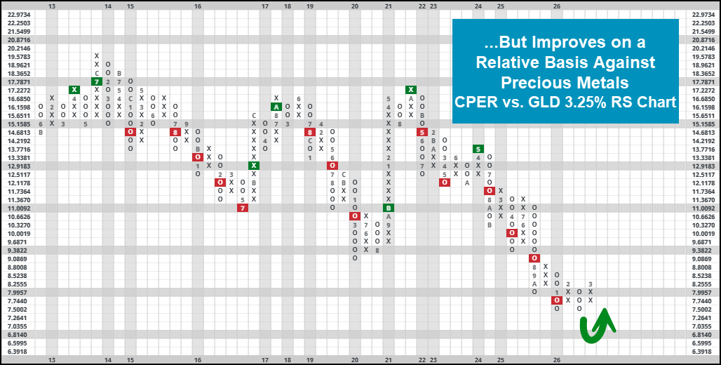
We will start with a 3.25% PnF chart between CPER & GLD. Gold’s recent weakness allowed copper to reverse back higher into X’s on this chart, symbolizing near-term relative strength for the more industrial-based metal… although gold has maintained its share of long-term strength since mid-2024. It’s worth noting that, historically speaking, we have seen gold mainly take over during periods of economic contraction (note dotcom bubble and GFC) while copper has led during times of general expansion. Now- its safe to say that more recent trends haven’t followed suit as precious metals have stormed forwards over the last few years alongside other risk on assets, but the longer-term picture remains intact. Those following an RS Switching strategy (owning whichever asset in on an RS buy signal) have outperformed a simple buy and hold strategy of either asset on their own.
Converting this relationship into a line chart for the physical commodities (compared to ETF representatives) over time, we can see that story play out through a different view. Using data spanning back to 1993, the copper/gold ratio (price of copper/price of gold) has been on a steep decline since the most recent bull market began in late 2022/2023. Zooming out even further, the ratio is near all-time lows- signaling leadership from gold as you would expect…. Particularly over the last few years. As trend followers, we would ultimately expect this continue going forward, at least until we are convinced otherwise.

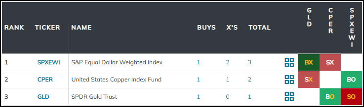
Finally, we will wrap up our piece with a reminder that performance (and subsequent leadership) is all relative. Remember, there will always be an identified leader between two stocks, even if both of them are names that are weakening (i.e., gold & copper have both weakened, but gold still looks “better”). To combat this, we can utilize the matrix methodology to run a larger batch of RS tests for a wider universe. To demonstrate this, we threw GLD & CPER into a matrix with broad S&P 500 representative SPXEWI. In this case, SPXEWI lands at the top of the heap, re-establishing itself against GLD with recent action. We could run a similar test adding in different representatives from different broad asset classes (take international or fixed income names, for instance) to gradually build out a wide matrix based ranking system. This is similar to the overall DALI rankings, and can be used to help guide your hand when it comes to broader asset allocation. As always, set alerts on key relationships to be notified of any changes as they occur.