Lots of recent research has referenced the idea of market participation. Today we peak underneath the hood to see what sectors are leading/lagging behind from an equal weight perspective.
Many recent reports have touched on breadth within broad markets and where the recent improvements leave participation as we move into 2026. However, it is important to remember that this idea of market participation isn’t black and white. Just like there can be weak stocks in otherwise strong sectors (or vice versa), any given sector’s participation can vary vastly from that of the overall market. In fact, if you call in and ask the analyst team, most of us will agree that a core part of our security selection process in a given is identifying whether we can throw a dart at a list or perhaps need to be more selective. A sector with broader participation suggests we can deploy assets in a more equal weighted fashion, while narrower participation might suggest we need to focus on the select few names that are performing well.
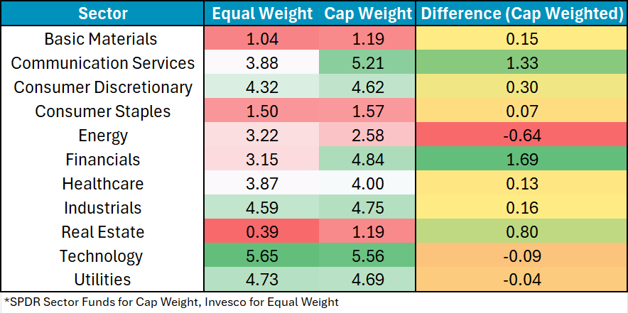
We can dig a bit deeper into this idea of sector participation by looking at the technical pictures of a suite of equal-weighed sector representatives compared to cap weighted options which primarily focus on a subset of smaller names. The idea being, a preference for cap weighted options would suggest a smaller group of larger names is leading the way, while a preference for equal weighted assets denotes a more balanced approach to a sector’s strength or weakness. The table below starts our analysis with an absolute perspective, comparing each sector’s representative and their fund score as of 12/10/25. A couple of general observations.
- Most sectors are quite close in overall fund score, but the overall trend is that the cap weight representative outscores the equal weight option by .35 fund score.
- Nearly every sector sees both options earn the same “rating” by NDW standards. The major exceptions being Communication Services (EW Hold, CW Buy) & Energy (EW Hold, CW Sell).
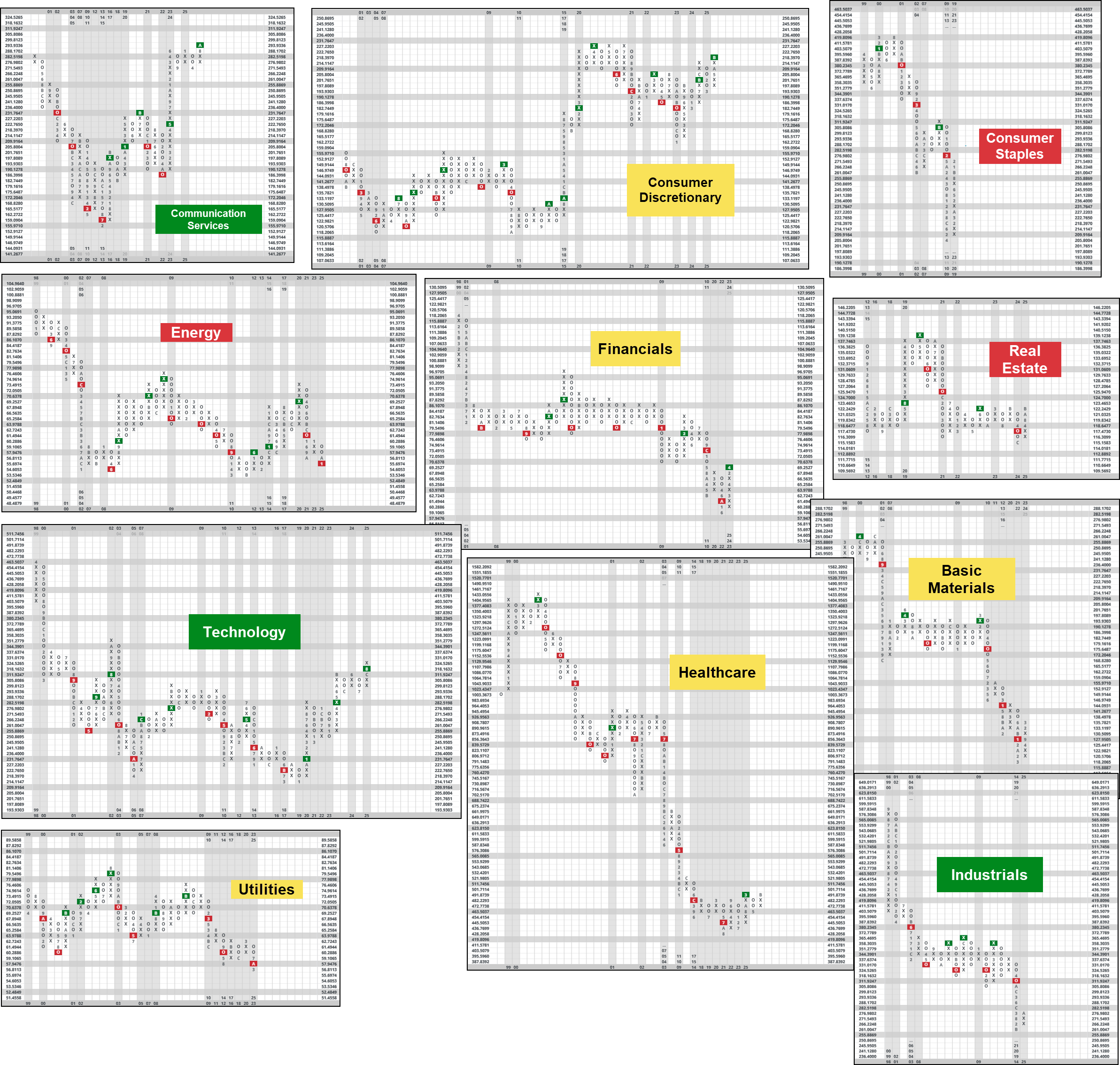
But as many NDW faithful know, the absolute picture is often times just the start of our analysis. When trying to select between two similarly strong assets, we can use relative strength tests which pit options against each other in an arm-wrestling contest. Below we pushed together 11 different RS charts, one for each sector comparing equal and cap weighted options. Do note, the most “consistent” chart scale to compare ended up being a 2% scale, which is different than the normally quoted 3.25% scale. The reason for the smaller scale is to allow more price action to enter the chart since many of them trade somewhat similarly despite the differences in weighting of top holdings. The colors relate to the sectors ranking in DALI. While large trends remained consistent, there were a few interesting charts:
- XLC vs. RSPC shows cap weighted options at its highest recorded level of relative price.
- XLK vs. RSPT is at its highest level since 2002 before the dotcom bubble burst. This isn’t an inherently bad thing but is at least conversationally interesting. Said plainly, the big tech companies are expensive, relatively speaking.
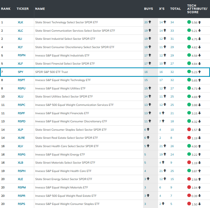
Of course, it can also be useful to zoom out of the pure 1 to 1 relationship and utilize the matrix to mash up many more RS charts. To do so, we can utilize the matrix tool. Included in the image below is the 22 different sector funds as well as SPY, which many of you might utilize as a form of sweepdown/benchmark. SPY sits in the 7th position, ranking behind more risk on areas like technology, communication services, consumer discretionary, etc. Of interest in terms of near-term winners/losers are healthcare and financials, both of which has moved from the barbells are the matrix more towards the center.
Today’s conversation reminds us that “overall market participation” can look quite different depending on where you stand and what sector you are looking at. For the most part, performance still appears to be driven by a smaller group of names, but utilize today’s exercise as a use case for identifying where and how to track changes as they occur in real time.