
Bitcoin hasn’t earned a starting role in a Daily Equity Report in quite some time, but it certainly isn’t for lack of try. Today we will look at the correlation between Bitcoin and Major Domestic Indices.
Beginners Series Webinar: Join us on Friday, April 14th at 2 PM (ET) for our NDW Beginners Series Webinar. This week's topic is: How to Utilize Participation Indicators Register Here
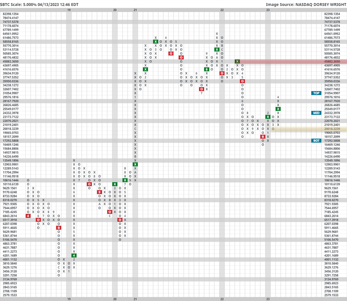
Bitcoin hasn’t earned a starting role in a Daily Equity Report in quite some time, but it certainly isn’t for lack of try. After spending the majority of 2022 in the doghouse, Bitcoin (amongst the rest of the crypto cohort) has had a productive 2023, up over 80% since January 1st. This positive performance has led to a series of productive technical developments, including $BTC re-entering a positive trend and posting its first buy signal against MNYMKT for the first time since late 2021. A previous cryptocurrency piece linked Here provided returns following historical RS buy signals in favor of the crypto king, with an impressive near 90% hit rate on positive future 1-year returns after posting such a signal. All things considered, the path of least resistance appears higher for the coin, and with its recent breach of $30,000 for the first time since falling through it last May, Bitcoin has certainly earned a second glance from the average investor.
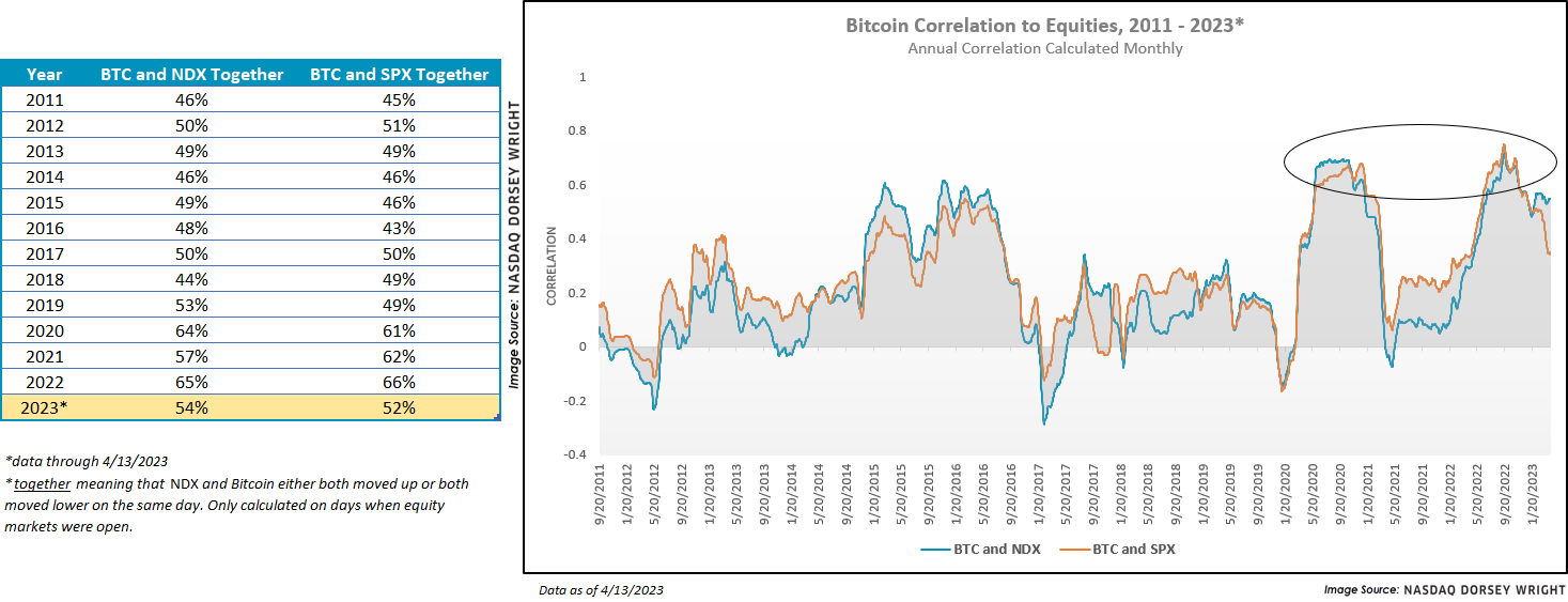
With the understanding that Bitcoin’s volatility isn’t suitable for every client, it can often be fruitful to observe how the equity markets and $BTC are interacting with one another. The chart on the left is simply measuring the percentage of days that Bitcoin and NDX/SPX move in tandem. In other words, what percent of trading days (excluding weekends) do Bitcoin and more traditional domestic equity indices rise or fall on the same day? While 2023’s partial data does show a downtick in the percentage over last year, there has been a distinct rise in the observed percentage over the last 12 years; with 2022’s numbers eclipsing 65% of mirrored movement for the first time in recorded history. The chart on the right shows a slightly more traditional rolling 12-month correlation coefficient. A similar picture here is shown: While the last few months have notched a now noticeable downtick in the price return correlation between [$BTC ] and SPX/NDX, there is certainly a point to make about where such correlation stands today in comparison to a decade ago. Another interesting point seems to emerge when you consider the two points at which price correlation was its highest: at market extremes. Both 2020 and 2022 saw spikes in correlation, but as we all well know… ended up in very two different places by the end of the year.
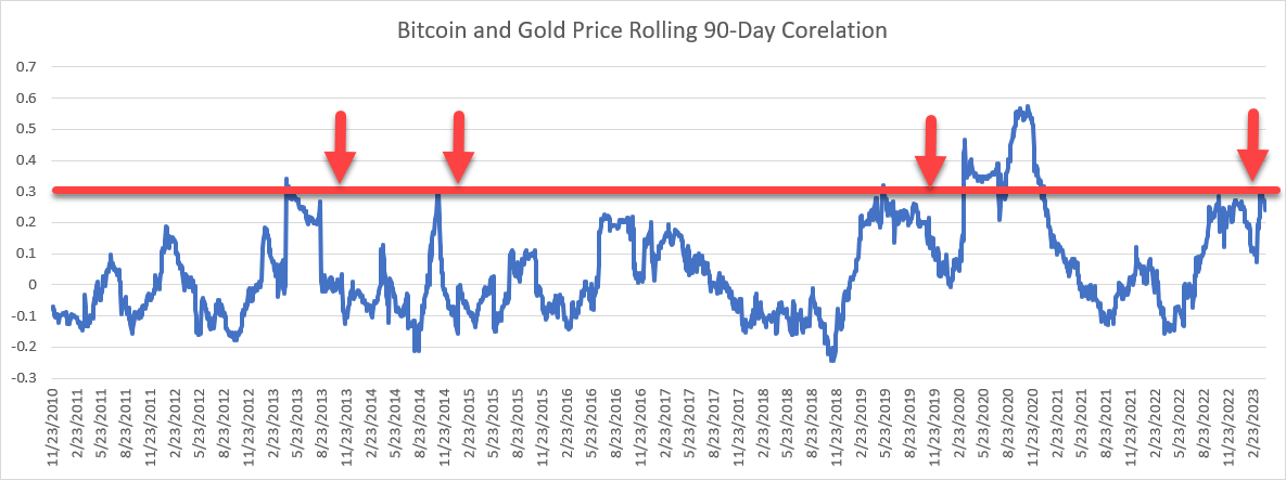
One final part of today’s report is an interesting relationship between Bitcoin as a “virtual” gold and the physical commodity gold. As we know, (GC/) has had a productive year, up over 10%. This has led the broad Commodity group into second place within the broad asset class rankings. Precious metals remain in the first position of all 134 groups on the asset class group scores page suggesting continued strength from the area. While today’s report isn’t a deep dive into the technical strength of GC/, it is worth noting the price return correlation between $BTC and GC/ is at a seemingly key level. While certainly not statistically significant, the correlation between the pair seems to top out at .30 from a historical perspective. From there, the correlation has seen a sharp drop off. While the most recent challenge of .30 in 2020 was followed by a breakthrough of the threshold, it seems like it is a breaking point for one reason or the other.
All things considered, continue to watch how Bitcoin’s price is moving going forward. While it may not be a mainstay in a traditional portfolio, price action suggests it may move more like our traditional equity markets than one may think.
