We examine previous shifts from growth to value and which sectors had the strongest performance.
After it was reported last Monday (11/9) that preliminary data showed Pfizer’s COVID-19 vaccine to be 90% effective, the market experienced one of, if not the largest, one-day momentum-laggard rallies ever. The Dow DJIA gained 2.95% on the day as stocks that have been hard hit during the pandemic, like Disney DIS and Chevron CVX enjoyed strong rallies. Meanwhile, the Nasdaq Composite NASD was down -1.53% as investors reduced their holdings in areas that had been leading the market, like technology. Over the intervening week-and-a-half there has been a lot of talk about the “rotation” trade i.e. a shift from areas, sectors, and styles that have performed well into areas that have lagged and thus, theoretically, have more upside during recovery. One of the primary shifts mentioned as part of the rotation trade is from growth to value, as growth has outperformed value in 2020 and for most of the last several years.
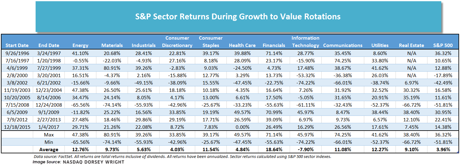
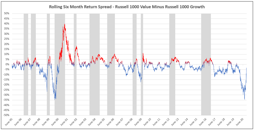
Of course, within each equity style, there are a wide range of stocks spanning multiple sectors. Therefore, today we wanted to examine previous shifts from growth to value to see which sectors had the strongest performance. We began by looking at the spread between the rolling six-month returns of the Russell 1000 Value Index and the Russell 10000 Growth Index since 1995. Each time the spread peaked at 5% or more in favor of value, we looked back to a recent trough (i.e. when the spread was in favor of growth) and calculated the returns for the 11 macro sectors over that period. For example, we can see that around March 20, 2001, the spread peaked at a little over 39% in favor of value, so looking back we find it hit a trough (i.e. the relationship most favored growth) in February 2000, when the spread was just shy of -35%. We then calculated the sector returns for the interim period (2/8/2000 – 3/20/2001). The periods we examined are shaded in gray in the chart below; the line is red during periods when the spread is greater than zero (i.e. value outperformed) and blue during periods when the spread is less than zero. As the chart shows, the spread between growth and value has already narrowed significantly in recent months as it was almost -35% (in favor of growth) in September, but has risen above the -5% mark within the last week.
There was significant variance in the length of the periods in our study, ranging from just 88 days to more than 400 days, therefore all of the returns in the table below have been annualized in order to make them more comparable. The best performing sector, on average, during the periods we examined was financials with an average annualized return of 18.64% followed by energy, utilities, and consumer staples. On the other hand, the worst-performing sector on average was technology with an average annualized return of -7.9% and is the only sector with a negative average annualized return. Technology was also the only sector with an average return lower than the S&P 500. On the surface this may seem strange, however, our study examined only the total return of each sector during the time period in question, it did not take into account the relative weights of the sectors within the index nor how those weights may have changed over time, which could have a significant impact on the performance of the overall index. Other laggards include health care, consumer discretionary, and industrials. Technology had the worst single-period performance as it experienced a decline equal to -74.22% on an annualized basis from 3/8/02 through 6/21/02. Materials had the single best one-period performance as it gained the equivalent of 80.91% on an annualized basis from 4/6/1999 through 7/27/1999. However, it also has the second worst single period performance as it had an annualized decline of -74.14% from 7/15/08 through 12/24/08.