
Throughout the remainder of the week, things went from bad to worse, especially with Friday's activity. The market fell substantially, and the calls were steady throughout the day. We will use today's report as an opportunity to address some of the "FAQs" we received last week and Friday afternoon in particular.
In Monday's Daily Equity Report from last week, we provided an in depth update on where we stand in terms of our "Defensive Preparedness" indicators. What we found is that the weight of the evidence had shifted from positive to negative with the last few weeks of market activity. Throughout the remainder of the week, things went from bad to worse, especially with Friday's activity. The S&P 500 SPX fell through another key support area taking out its August/September lows at $1880 on the 20-point per box chart with a low of $1860. The Dow and the Nasdaq were both also down substantially as well, and the calls were steady throughout the day. We will use today's report as an opportunity to address some of the "FAQs" we received last week and Friday afternoon in particular.
1. What's going on with the Market?
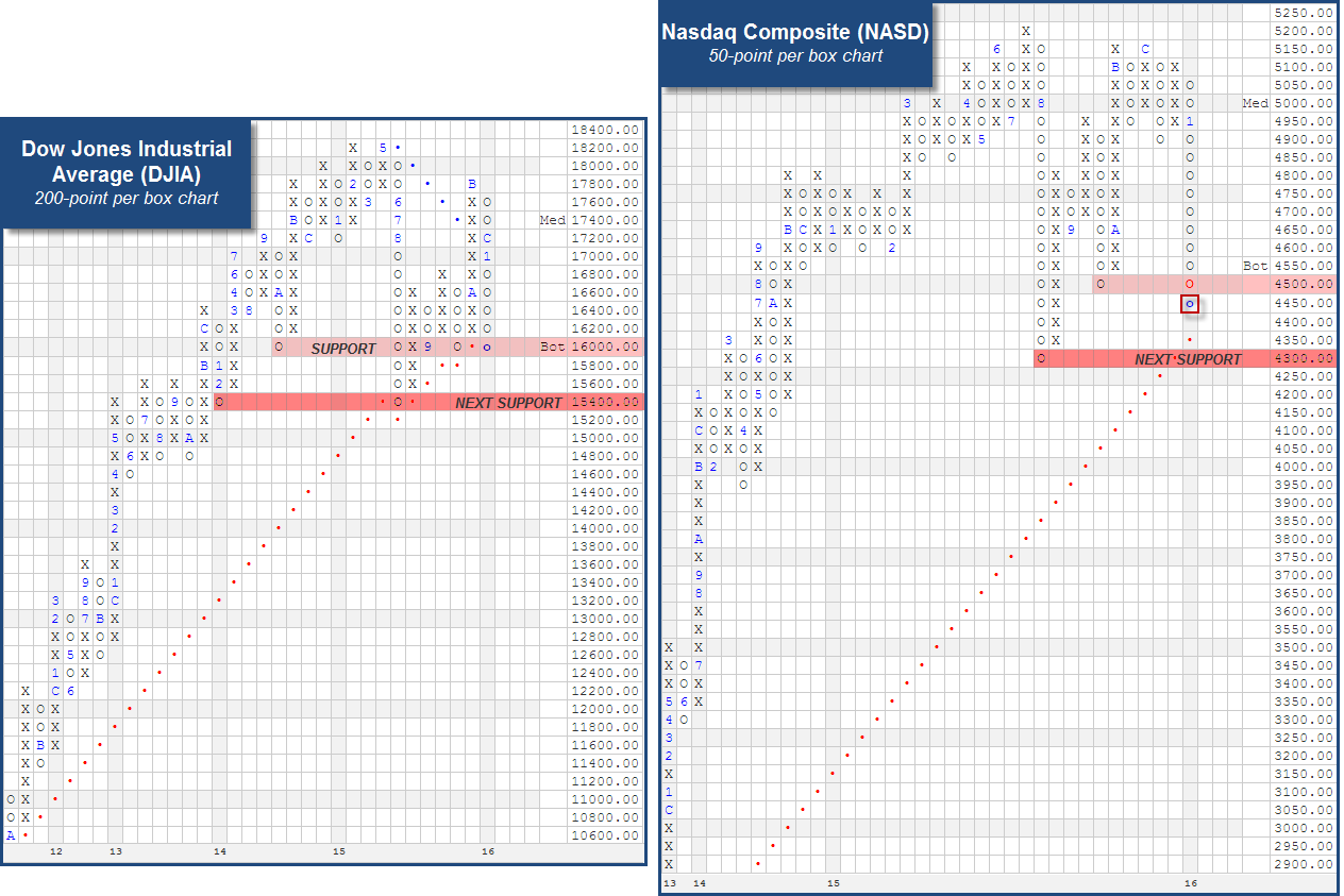
This is a broad question that perhaps can be best addressed by looking at the trend charts of the broad indexes. Below you will find a snapshot of the PnF charts for the SPX, the DJIA and the NASD. Looking at these charts, if we ask ourselves, "What's going on with the market?" the answer is clearly that supply is in control of equities at this juncture. Below are some key observations for each chart:
- S&P 500 Index SPX
- Long-term trend: Negative
- Point & Figure Signal: Consecutive Sell Signals
- Violated key support with a move to $1860 on Friday, completing a spread quadruple bottom and making a new 52-week low on the chart
- Next available support is between $1820 and $1840, which mark the pullback lows from April and October of 2014.

- Dow Jones Industrial Average DJIA
- Long-term trend: Positive by one box
- Point & Figure Signal: Buy
- The move to $16000 on Friday puts the chart up against key support from September and October of last year, as well as its bullish support line. A move down to $15800 would be a trend violation and triple bottom breakdown.
- Beyond $16000, the next available support on the long term chart is the $15400, which marks lows from August of last year and February of 2014.
- Nasdaq Composite NASD
- Long-term trend: Positive
- Point & Figure Signal: Consecutive Sell Signals
- The move to $4450 on Friday took out its September low, leaving its trend line and the August, 2015 lows as the next support at $4300.
2. Has this week's action caused any changes in key RS comparisons?
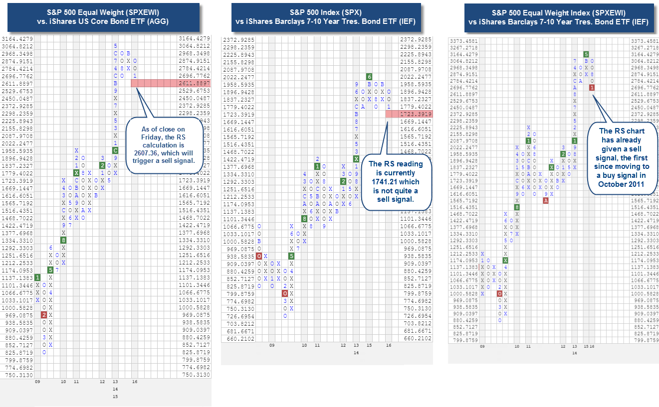
The relative strength relationships of Equity indices versus Fixed Income and/or Cash indices have been good indicators for us over the last twenty years. So not surprisingly, we, and many of you, are watching these closely. In the images below you can see that we are at a pivotal point on several of these charts, and have started to see some changes on others. One chart that is likely getting a lot of eyeballs is the SPX versus iShares Core US Bond ETF AGG. Because we use closing prices for RS calculations, this chart will not quite reverse into O's as the market was able to rally back from its intraday lows on Friday afternoon. A reversal on that chart would put us one box from a sell signal, and the sell signal would be the first since moving to a buy signal in the summer of 2009. In contrast to the SPX, the S&P 500 Equal Weighted Index SPXEWI has been struggling a little more as the large cap names have helped disguise some of the carnage. With Friday's close, the SPXEWI index will fall to a relative strength sell signal versus the AGG. The SPXEWI has already given a sell signal versus the iShares 7-10 Year Bond Fund (IEF). Should we have a plurality of these charts fall to sell signals, it would suggest an even more defensive stance and a posture of losing opportunity and not losing money. We can always make up opportunity but it’s hard to make up money. A final takeaway from these charts is that the sell signals don’t happen at the exact top, we don’t expect that, but when they do occur there is usually have decent follow through with equities continuing to face several months of supply being in control. We will continue to keep you updated on any changes in these charts.
3. What should I do with my stock positions? Sell? Buy? Hold? Duck-and-Cover?
The answer to this one is: review! While we do not recommend putting new money to work here, what we do recommend is that you are diligently reviewing each stock chart (and ETF or fund chart, for that matter). There are times where simply focusing on strong attributes/Scores and positive trend lines alone is adequate. This is not one of those times. Use the Portfolio tool and the Thumbnails view to be able to look at the trend charts for each of your holdings. What are you looking for? Well let's work through a couple of examples to help you hone in on what to pay attention for. We'll examine what we would categorize as a good stock versus a bad stock.
- The Good Stock: The Clorox Company CLX
One theme we have noticed over the last few weeks, and often comes to the surface during tough markets is a "flight to safety". This means the Large Cap, low beta, higher yielding names are typically the areas that hold up and may even show signs of increasing demand. CLX is an example of such a stock. It is also categorized within the broad Consumer Non-Cyclical sector, which finds itself in the #2 ranked spot of the Sector level of DALI. Looking at the default chart, notice that CLX has done little more than pullback toward the middle of its 10-week trading band. However, the default chart also doesn't offer any viable support until the $106 level, so we have included the more sensitive 1-point per box chart to show several reasonable support levels. A violation of these levels can be used as partial or full stops for any open positions moving forward, but as of now, there has been no material breakdown on the chart, and it remains above even its November support. One of the main reasons CLX remains on our "hold" list, though, is not the attractive chart, but the fact that it is one of just 9 stocks in the entire S&P 500 that have given a new market RS buy signal. This confirms that CLX is a positive diverger. Finally, CLX offers an attractive yield of about 2.4%.

- The Bad Stock: Apple Inc. AAPL
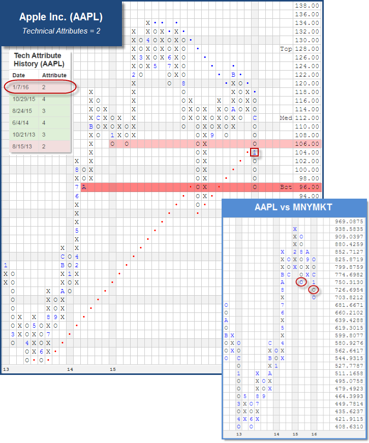
While Apple might not be the absolute worst stock out there, we selected it for this exercise for two reasons. First, everyone wants to know about Apple. Second, Apple is a position that is very easy to get emotional about. From a strictly objective, technical standpoint, the weight of the evidence is negative for AAPL, which is the first time in a few years that this has been the case. In fact, with the recent trend line violation the stock downticked to a 2 for 5'er, making it a weak attribute name for the first time since October of 2013. AAPL can be categorized as a negative diverger given that it violated its September lows ahead of the market earlier in the month. If we ignore the volatile action that occurred on the chart during the trading session on August 24th (with the stem down to $92), we find that the move to $104 actually took out all of the support built in 2015. It's current move to $96 puts it right up to its October 2014 low. Additionally, take a look at the RS chart of AAPL versus Cash MNYMKT. It initially fell to a sell signal in August, demonstrating weak RS versus Cash. While it was able to rally ahead of the market and return to X's in September and October, it has since returned to a column of O's and completed a second sell signal on this RS chart. The last time this chart was on a sell signal was back in mid-2013. For these reasons, AAPL is characteristic of stocks that should be sold out of the portfolio, especially on any future bounce over the next several days.
4. What should I continue to watch?
There are two indicators we will be keeping a close eye on in the coming days and weeks, both found within DALI.
- The first is the main DALI Asset Class Rankings 1-6. Specifically, we will be watching for US Equities to abdicate the #1 spot. Now, in order for that to happen, we will have to see US Equities give up Relative Strength buy signals versus other asset classes. Just in the last week (not including Friday's action), it has already given up almost 40 buy signals, falling from 341 down to it's current reading of 302 (see tally rankings below). Note that most of these signals have landed in Fixed Income (which has picked up about 13) and Cash (which has picked up about 18). Currencies are responsible for picking up the rest. So the leadership is shifting to defensive asset classes. Should US Equities fall out of the #1 spot, this would force a change in the allocation across each of the DALI Tilt Strategies.
- The second will be the Cash Percentile Rank Reading for US Equities. This week we saw the reading rise above 33%, giving us a cautionary yellow light. If that reading continues higher from here, it will signal towards the need to be more and more defensive. A "red light" will appear on this indicator if the percentile ranking moves above 66%.

