|
Dorsey, Wright & Associates developed its sector relative strength charts in 1997. Until the introduction of sector based
Exchange Traded Funds (ETFs) in 2000 with Barclays Global Investors and their iShares ETF, there was no way to buy a
sector index. This landscape changed in 2000 with the introduction of ETFs based upon the Dow Jones sector indices
and the ETF world hasn't looked back since. At this writing, there are over 110 sector based ETFs available for purchase
and it seems more are added each month.
Let's back up a second and review what is an ETF. ETF stands for Exchange Traded Fund. Every ETF is designed to track
and underlying index. For the purposes of this discussion we will focus on sectors but ETFs are available for broad based
market indices, international markets, commodities, currencies, and fixed income instruments. Unlike a mutual fund,
which is also a basket of stocks, ETFs are transparent. That is, the investor always knows what stocks are held in the
ETF and in what weightings. Also unlike a mutual fund, ETFs trade like stocks. They can be bought intraday, stop and
limit orders can be placed, and short positions can be taken in ETFs.
|
 |
|
The calculation for an ETF relative strength reading is very similar to the other calculations with one exception and
that is the underlying base index. The daily relative strength calculation of an ETF is to take the price of the ETF
and divide by the iShares Dow Jones Total Market Index (IYY). This number is then multiplied by 100 and the resulting
number is plotted on a Point & Figure chart. The IYY is used in this calculation because it is a broader based index
of over 1500 stocks and most sector ETFs tend to incorporate large, mid and small cap stocks much like the IYY. When
evaluating an ETF relative strength chart, a column of X's would signify that ETF is likely to outperform the market
while a column of O's would signify that ETF is likely to underperform the market.
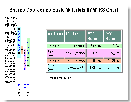
Let's look at an example using the iShares Dow Jones Basic Materials Sector (IYM). Since 1992 this RS chart has had
four columns - 2 X's and 2 O's. While each column didn't last two years, the average time for a column change in the
IYM was about 3 1-2 years. Again, with relative strength charts we are looking for long term trends. And, not every
signal worked perfectly. However, the majority of signals worked and the relative strength chart correctly captured
major shifts in performance by the sector. For instance, from 1992 to 1999, the IYM relative strength chart was in O's
and during this time, the IYM was only up about half as much as the overall market. Since 2000, when the relative
strength chart reversed up to X's to suggest outperformance, the IYM is up almost 60% while the IYY is only up 1.5% -
clear outperformance.
|