|
One of the most
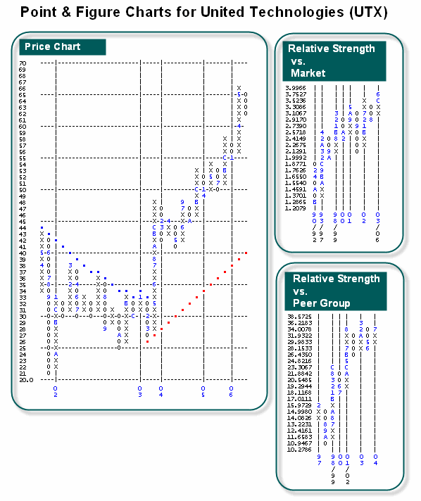
important tools in a Point and Figure toolbox is the relative strength chart. The basic
objective of all investors is to outperform the broad averages and the only way to do
that is to own stocks that are outperforming the averages. The best way to tell whether
your stock is outperforming is to evaluate its performance relative to a market average.
Dorsey Wright uses Point and Figure Relative Strength charts. These
point and figure charts measure a stock's performance relative to a given index. These Relative Strength charts
and the calculation used to create them is in no way similar to other RSI numbers such as those
found in the Investors Business Daily.
For each and every stock and mutual fund, there will be two relative strength charts. One is a measure of how
the stock (or fund) is performing versus the market and the other is a measure of how the stock (or fund) is
performing versus others in its same sector or industry. To keep it straight in your mind, there are
essentially three charts that accompany every stock or fund - one is the price chart, a relative strength chart
versus the market, and a relative strength chart versus the industry group.
|