| Welcome: |
|
| Lesson 5: |
Part 1 - Continued |
|
The same principles used with the market bullish percent charts
apply to the Sector Bullish Percent charts. To create a valid sector bullish percent chart, we like to
have at least 100 stocks, though sometimes we will work around that but it is a good guideline. Sector
bullish percent charts can move to greater extremes than the broad market bullish percents too because
of the fact they have fewer stocks.
Let's quickly review some of the tenets of a sector bullish percent chart. :
Sector Bullish Percent Chart Tenets:
- Grid goes from 0% to 100%.
- Each box is worth 2%
- It takes a 6% change from sell signal to buy signals or vice versa to change columns.
- A column of X's suggests demand is in control of the sector.
- A column of O's suggests supply is in control of the sector.
- Oversold conditions occur when the sector is below 30%.
- Overbought conditions occur when a sector is above 70%.
- Good field position is considered at or about the 50% level and in X's.
|
We will not review each sector bullish percent chart one by one, however, it is important that you take the time to
look at them on your own. By evaluating each of these charts you will learn the nuances of each sector. Again,
this is the "art" of the methodology. Some sectors have wild swings to chart extremes while others seem to move
in a more confined area. Understanding this, knowing where a sector typically tops or bottoms, helps you better
evaluate the risk in a particular sector.
Let's look at an example of a bullish percent chart, Software, and discuss the insight this indictor gives into
the sector. We'll start with October 2002 when the sector was at 10%. A three box reversal up to X's happens at
16% and tells us that 6% of the stocks have gone from sell signals to buy signals and demand is moving back into the
sector. With the offensive team on the field and the sector at a very washed out condition, now is a good time to
consider new positions.
|
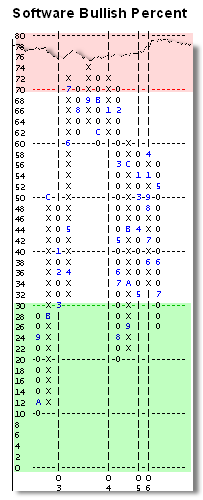 |
The sector remains in X's and moves up to 50%. Then in December 2002, the bullish percent chart reverses into O's
and suggests the group is ready for a breather. Now would be a time you examine your portfolio for Software stocks
and know where your stop loss points should be place. It would also be a good time to weed out stocks with weak
relative strength.
The Software sector indeed experiences a pullback, coming back to 30% by March 2003. This is a higher bottom on
the chart with the next reversal up to 36% in April 2003 and provides another opportunity to buy stocks in the
group with great field position. This reversal up to X's carries the sector into the red zone area of 70% and above.
Once above 70%, it tells us the availability of demand to push the sector higher is limited. We see the sector gyrates in the 70% area for several months and this is not unusual. A double bottom on the chart at 60% in December 2003 is definitely worrisome. This is a call to action that if we own software stocks, now is the time to start thinking about ways to play defense. On the next reversal up we see that the Software Bullish Percent makes a lower top to suggest fewer stocks are carrying the group. The next reversal down in February 2004 is the one that takes the sector below the 30% level and the process starts all over again.
|